library(ggplot2) # plotting libraryWarning: package 'ggplot2' was built under R version 4.5.2source("http://bit.ly/theme_pub") # Set custom plotting theme
theme_set(theme_pub())All of the statistical models explored in this book require a basic understanding of populations, and sampling distributions. You should already be familiar with generating random numbers from different distributions, as covered in the R Crash Course for Biologists. These sorts of distributions form the basis for investigating biological data, from the summary statistics that tell us about the characteristics of our data, through to the most complicated statistical models for hypothesis testing.
In this chapter, we’ll use those functions to generate a deeper understanding of distributions as a basis for the concepts of populations and samples. Then, we’ll look at the t-test and some basic statistical distributions.
library(ggplot2) # plotting libraryWarning: package 'ggplot2' was built under R version 4.5.2source("http://bit.ly/theme_pub") # Set custom plotting theme
theme_set(theme_pub())The population and the sample are two core concepts in probability and statistics. Be careful not to assume that you know what they mean. Both words can have several meanings in the English language, but in statistics they are very specific concepts.
The statistical population is a group of individuals or objects that we are ultimately interested in. Typically, we can’t examine every individual in the study population, because the population is too large or broadly distributed to measure every individual. We might be interested in a population of polar bears in Nunavut, or our population might be a specific inbred line, or all humans on the planet. In statistics, we can’t measure the population completely, so we try to collect a sample of individuals to make inferences about the population.
The statistical sample, or mathematically a subset, is the smaller number of individuals or objects that we can observe. For reasons that will become clear later, a key assumption of statistics is that our sample is random and unbiased with respect to the population of interest. Biologists who do not have a strong statistical training may overlook this crucial detail, or fail to give it the attention it deserves. If we are interested in polar bears in the Arctic, but we only sample from Greenland, we have a biased sample. Similarly, if our population is a genotype but we only measure it in one environment, then our inferences are specific to those rearing conditions.
The goal of statistics is to make inferences about the population based on observations we can make about the sample. Typically, the larger our sample, the more confidence we have about the characteristics of our population – as long as our sample is random and unbiased.
Both populations and samples can be characterized by their frequency distribution. A frequency distribution is typically a histogram that visualizes all of the observations, divided into bins. Bins are categories representing a range of values of continuous data (e.g., 0 to 0.9, 1 to 1.9). Bins are useful for categorizing continuous data, which we’ll use extensively to make histogram plots. Test statistics also have distributions based on expected values of particular metrics (e.g., \(t\), \(\chi^2\), \(F\)). More on this later.
In R we can very quickly generate sample distributions by generating random numbers and plotting them.
To generate a random sample in R, we have to assume some kind of population distribution. There are many population distributions to chose from, but let’s take a look at a few of the most common distributions in biological data:
| Distribution | Data Type | Example |
|---|---|---|
| Gaussian | Continuous data | height or length |
| Poisson | Count data | seed or egg number |
| Binomial | Bernoulli or Boolean data | Allele (A or a) |
The Gaussian distribution is probably the first distribution you learned about in your introductory statistics class or textbook. It fits many kinds of continuous measurement data. The rnorm() function in R can be used to sample from a Gaussian distribution. We were introduced to this briefly in the R Crash Course for Biologists, but you may want to review the help as a refresher (?rnorm).
?rnormNotice the 3 key parameters of rnorm:
n – number of observations (sample size)mean – vector of means (of the population)sd – vector of standard deviations (of the populations)We can use this to generate a random sample to quickly visualize with ggplot(). Let’s imagine we catch 20 lizards and measure their tail lengths. We’ll create a model for a population mean of 20 and standard deviation of 2.
Tails<-rnorm(n=10, mean=20, sd=2)
ggplot() + geom_histogram(aes(x=Tails))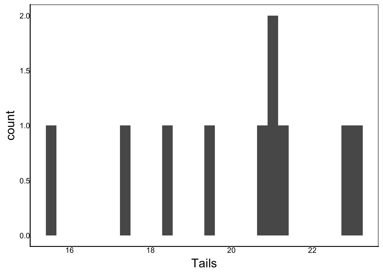
Take a second to compare your graph with this one and you should see some differences. That’s because we’ve randomly sampled different individuals from the population. Recall from the R crash course that we can use the set.seed() function to always choose the same random sample
set.seed(1234567890)
Tails<-rnorm(n=10, mean=20, sd=2)
ggplot() + geom_histogram(aes(x=Tails))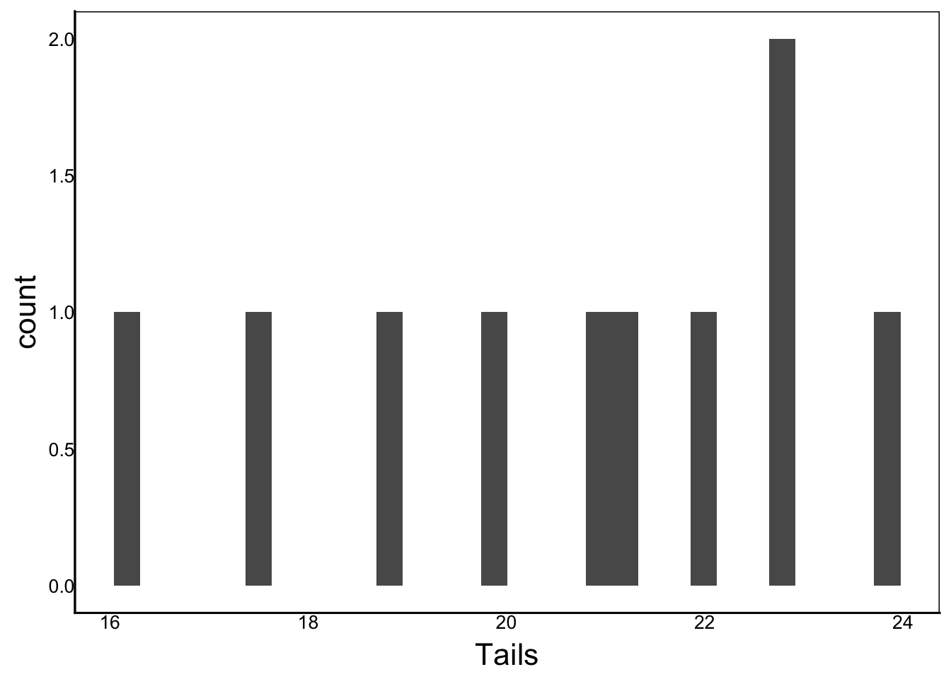
Notice also in the description above that the mean and sd parameters are described as vectors. In our example we used a single value for each, representing a vector of length = 1.
Question: What happens if you use a vector with more than one element (e.g.,
c(20,0))? Run a few examples withoutset.seed()to see if you can figure it out before reading the answer below.
Answer: Using a vector of two numbers simulates samples drawn from two alternating populations with different means and/or standard deviations.
rnorm(n=10,mean=c(-10,10),sd=c(0.1,10)) [1] -10.135140 4.216443 -10.022665 24.410168 -10.074376 15.294139
[7] -9.841587 14.872112 -9.897160 19.417658The Poisson distribution is common for count data, meaning that the sample will contain only integers that are greater than or equal to zero. The rpois() function draws from a Poisson distribution.
?rpoisFrom the help file we can see two key parameters:
n – number of observations (sample size; same as rnorm)lambda – vector of means (must be > 0)Let’s simulate a sample of egg number from the same lizards we captured above
Eggs<-rpois(n=10, lambda=4)
ggplot() + geom_histogram(aes(x=Eggs))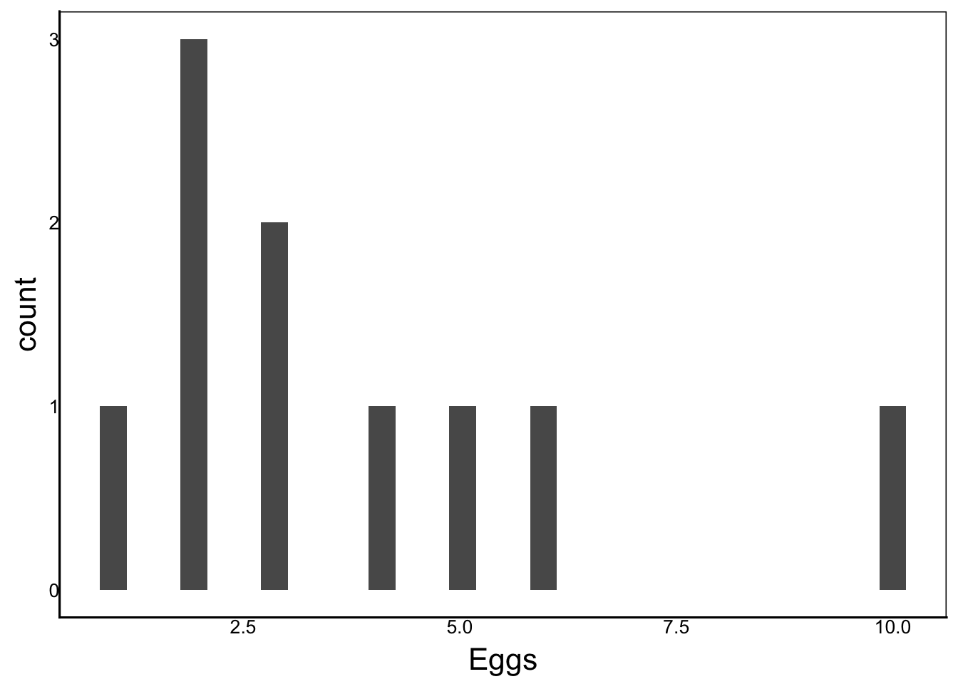
Question: What is the average number of eggs per lizard in the population?
Answer: Review the R Fundamentals chapter in the R Crash Course if you aren’t sure how to calculate this.
The binomial distribution describes a population of a Bernoulli or Boolean variable. The most popular example is the coin flip, but it can be anything that can be encoded as TRUE/FALSE (or 0/1).
The rbin function draws from a binomial distribution.
?rbinonHere we see three parameters:
n – number of observations (sample size, as above)size – number of trialsprob – probability of success on each trialWhat’s the difference between n and size? This is a bit tricky, and easier to explain with examples.
Imagine we again sample 10 lizards and check whether they are male or female. Let’s also say that the population has an equal sex ratio: 50% male and 50% female
Females<-rbinom(n=10, size=1, prob=0.5)
ggplot() + geom_histogram(aes(x=Females))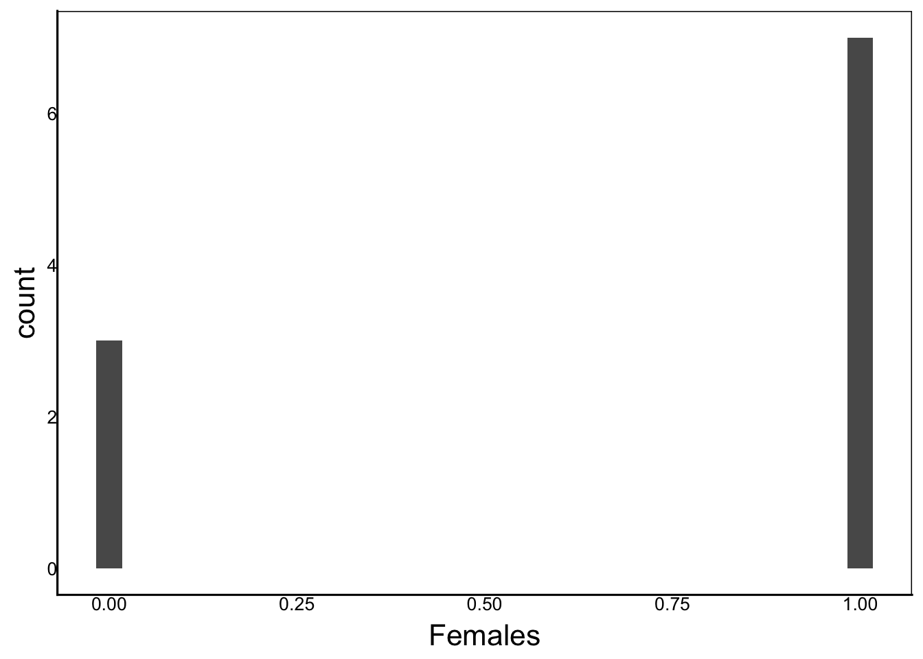
In this example, we set size=1 because we are only sampling one lizard.
Now imagine that we want to sample eggs in a lizard’s nest and look at the embryos developing in their eggs to determine if they are male or female. We’ll sample 5 eggs per nest and count the number of female embryos (EggF).
EggF<-rbinom(n=10, size=5, prob=0.5)
ggplot() + geom_histogram(aes(x=EggF))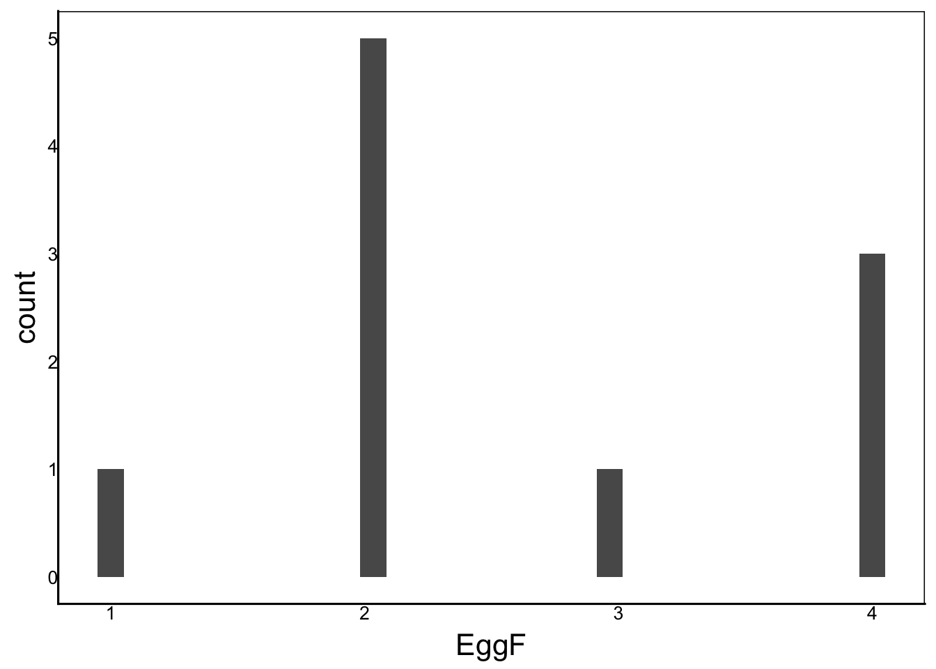
Question: Some lizards have temperature-dependent sex determination. Which parameters would you change to model a biased sex ratio of 60% females and 40% males in the embryos?
Answer: The ratio in the population determines the probability of sampling one or the other, which we can define with the prob parameter in the rbinom() function.
Now, let’s compare the two binomial graphs. How are they different and why? Think about what each graph represents.
If you aren’t sure, then using R to look at the raw data might help:
head(Females)[1] 1 1 0 1 1 0head(EggF)[1] 4 2 2 2 3 4str(Females) int [1:10] 1 1 0 1 1 0 1 1 1 0str(EggF) int [1:10] 4 2 2 2 3 4 2 2 4 1In the first case, we are sampling 10 lizards to check whether they are female. These data are Boolean (1/0 or true/false). When we plot them, we get a frequency histogram showing the number of ones and zeros.
In the second case, we are sampling 5 eggs and then counting the number of female embryos per adult female. Note that these data are count data similar to the Poisson distribution except that we can’t have more than 5. If our size= parameter increases and p is small in the binomial distribution, we get something very similar to a Poisson distribution with lambda = p*size.
If lambda is far from zero, then our Poisson distribution will be very similar to a Gaussian distribution with mean = lambda.
Question: How can you use rbinom(), rpois(), and rnorm() to visualize this for yourself?
It’s worth taking the time to think about this and try to write a rprogram to see these relationships. The time invested will pay off later when we apply statistical models to real data.
One way we could do this is to set up a data frame and use facets:
# Binomial data frame
BinDat<-data.frame(
  X=rbinom(n=999,size=c(1,10,100),prob=0.3),
  Parm=rep(c("Size=1","Size=10",
             "Size=100"),333),
  Dist="1_Binomial")
# Poisson data frame
PoisDat<-data.frame(
  X=rpois(n=999,lambda=c(1,10,30)),
  Parm=rep(c("Lambda=1","Lambda=10",
           "Lambda=100"),333),
  Dist="2_Poisson")
# Gaussian data frame
NormDat<-data.frame(
  X=rnorm(n=999,mean=c(1,10,30),sd=c(1,2.5,5)),
  Parm=rep(c("Mean=1","Mean=10",
         "Mean=100"),333),
  Dist="3_Gaussian")
# Combine data frame
PlotData<-rbind(BinDat,PoisDat,NormDat)
# Add plotting category
PlotData$Group<-paste(PlotData$Dist,PlotData$Parm)

# Plot
ggplot(aes(x=X),data=PlotData) +
  geom_histogram() + facet_wrap(vars(Group))
`stat_bin()` using `bins = 30`. Pick better value `binwidth`.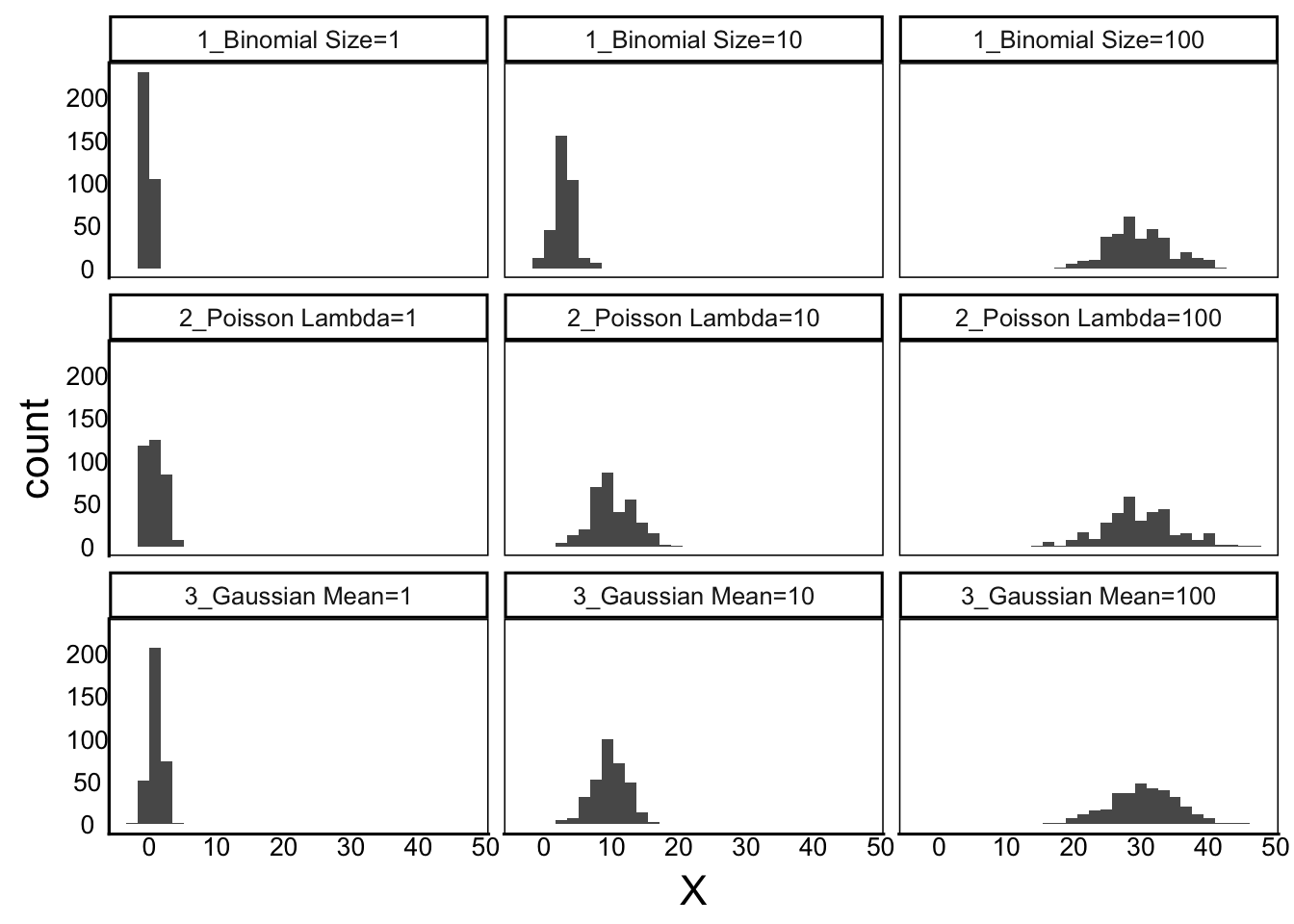
Note the change in variance in each graph. Variance is not specified in the Binomial or Poisson model, but we can see that the variance increases with the mean in both cases. The Gaussian distribution requires a standard deviation parameter, which we increased from 1 to 2.5 to 5 in our code.
In our code, we increased the variance in the Gaussian distribution
In addition to visualizing our sample distributions as histograms, we can calculate some basic characteristics about our distributions. These parameters can describe the distribution of our entire population or the distribution of a particular sample drawn from the population. The equations are similar, so we need to use different symbols to make it clear whether we are referring to the sample or the population.
We’ll use this convention:
| Metric | Sample Symbol | Population Symbol |
|---|---|---|
| Individual | \(x_i\) | \(x_i\) |
| Mean | \(\bar x\) | \(\bar X\) |
| SD | \(s\) | \(\sigma\) |
Note that the individual term \(x_i\) is the same because the individual sample is also an individual from the larger population.
Protip: the above symbols are made with LaTeX encoded in R Markdown. It’s easy to do this in an R Markdown document, as explained in the R Crash Course book. For example, the sample and population symbols are written in R markdown as: $x_i$, $\bar x$, $\bar X$, $s$, and $\sigma$ in the table.
The sample Mean is the average value, calculated by adding up all of the individual observations (\(x_i\)) and dividing by the number of observations (\(n\)).
\[\bar x = \frac{ \sum x_i }{n} \]
Protip: LaTeX code for the above equation is
$$\bar x = \frac{ \sum x_i }{n} $$
Question: Can you write a line of code for the above equation, applied to a vector of lizard tail length measurements?
Answer: It’s just a matter of breaking the equation down into components and then either using an available function or writing a custom function for each component.
sum(Tails)/length(Tails)[1] 20.55558Or, we can use the mean() function in R.
mean(Tails)[1] 20.55558It’s critical that you understand that these are the same calculation. Many biologists, including me, did not receive university-level training in mathematics and statistics. This makes us suceptible to the myth that we are just bad at math. Now consider that this one function mean(Tails) is the same as this equation: \(\bar x = \frac{ \sum x_i }{n}\). If you understand that a mean is just the sum of a vector divided by its length, then you understand the equation. As biologists, we think we are bad at math because we don’t recognize equations at first glance. But this is because we so rarely encounter them. Once we take the time to work through them and turn them into code, they suddenly don’t seem so complicated. Keep that in mind as we work through more complicated equations.
The Standard Deviation of a sample (\(s\)) is just the square-root of the variance (\(s^2\)). In a Gaussian distribution, variance describes how much the data spreads out away from the mean. The variance equation takes each value \(x_i\), subtracts the mean \(\bar x\), and squares it. Then it adds all of these values together and divides by one less than the sample size. This long and complicated explanation can be expressed more accurately and efficiently as an equation.
\[ s^2 = \frac{ \sum (x_i - \bar x)^2 }{n - 1} \]
Question: Can you translate this equation to R?
Before you follow along with the code below, try to write the code yourself. The key is to break it down into individual steps. First, subtract each value by the mean. Second, square that value. Third, divide by the number of observations minus 1.
Protip: Don’t get tripped up by the math. Just try to break it down into components.
Answer: Here is one way to code it.
sum((Tails-mean(Tails))^2)/
  (length(Tails)-1)
[1] 6.108863Be careful with placement of parentheses (), this is a common source of error.
It’s worth taking the time to work this out, even though there are more direct ways to calculate this in R.
sd(Tails)^2[1] 6.108863var(Tails)[1] 6.108863Taking the time to work through these equations in R will help to develop your math skills as we move to more complicated equations.
The Coefficient of Variation (\(C_V\)) sometimes called the relative standard deviation (RSD) is simply the standard deviation divided by the mean. This can be useful because the variance of a sample often scales with the mean. Often the \(C_V\) is multiplied by 100%, though this isn’t always the case.
\[ C_V = \frac{s}{\bar x} \times 100\% \]
Note: The population mean (\(\bar X\)) and standard deviation (\(\sigma\)) and other characteristics of the population, are not calculated from the data. Instead, they are characteristics that are either:
Set by you in your simulation using the parameters of your random number generating function rnorm(), OR
Unknown values that you are trying to estimate by measuring your sample population
Sometimes it is helpful to think about the population parameters as the true values, and the sample parameters as estimates of the true values. This relationship is based on a very cool phenomenon that forms the basis for all of probability theory – the central limit theorem.
What is the relationship between the distribution of a population and the distribution of a sample? Let’s go back to our lizard tail data to explore this question.
set.seed(25)
Tails<-rnorm(n=10, mean=20, sd=2)
In this code the mean of our population is 20 and the standard deviation of our population is 2. We know this because we defined these values in our rnorm() function. So what are the mean and standard deviation of our sample? They should be similar, but will vary a little bit due to random sampling:
mean(Tails)[1] 19.65125sd(Tails)[1] 1.884406What happens as we increase our sample size?
set.seed(25)
Tails<-rnorm(n=100, mean=20, sd=2)
mean(Tails)
[1] 19.63568sd(Tails)[1] 2.012269set.seed(25)
Tails<-rnorm(n=1000, mean=20, sd=2)
mean(Tails)[1] 20.0074sd(Tails)[1] 2.001422Question: What is happening to the mean and sd as the sample size increases.
The Central Limit Theorem describes this phenomenon. As our sample size increases, the characteristics of our sample distribution approaches our population distribution. This is an amazing feature of random samples – it’s almost like magic!
All of the above metrics (\(\bar x\), \(s\), \(C_v\)) are measured directly on the sample.
The standard error (\(SE\)), or sometimes the standard error of the mean (SEM) can also be calculated from the observed sample data, but it also takes advantage of the Central Limit Theorem to estimate a confidence interval, which we can use to get a range of predictions of the population mean. This is pure statistics magic!
\[ SE = \frac{s}{\sqrt n}\]
The \(SE\) is most useful for samples drawn from a Gaussian distribution because we can use it to estimate a confidence interval, as described in the next section.
We can’t predict the population mean with certainty, but we can use the Confidence Interval (\(CI\)) to identify a range of two values (high/low) that we predict should include the population mean.
For a Gaussian distribution, the population mean \(\bar X\) has a 95% chance of falling within +/- 1.96 \(SE\) of the sample mean:
\[ CI = \bar x \pm 1.96 \times SE \]
I find it easier to understand this kind of thing when I code it in R.
Let’s do one example with a smaller sample size. And another with a larger sample size and then compare the \(CI\) of each sample with the mean of the population:
set.seed(25)
N<-10
Tails<-rnorm(n=N, mean=20, sd=2)
x<-mean(Tails)
sd<-sd(Tails)
se<-sd/sqrt(N)
CI<-c(x-1.96*se, x+1.96*se)
print(CI[2]-CI[1])
[1] 2.335934Question: What does this code do?
Be sure to undestand each line of code before continuing. As usual, make sure you are typing it out to help get a sense of what we are doing here. Examine the individual objects if you aren’t sure.
In particular, note how we can calculate the \(CI\)
Now we could set N to 10,000 and re-run the code above:
[1] 19.95497 20.03342[1] 0.07844591Compare the \(CI\) calculated for the two different sample sizes, with the population mean (\(\bar X\)) and standard deviation (\(\sigma\)) as defined in the rnorm function.
Let’s dive a little deeper into what the \(CI\) represents. It’s a range of predicted population means. Larger samples will have smaller \(CI\) because the sample mean of a larger sample will deviate less from the population mean, as we saw earlier in the Central Moments Theorem subsection. This inverse relationship between sample size and uncertainty in the population mean is represented by the \(CI\). Of course, this all assumes that our sample is representative in that it is a random and unbiased sample of individuals from a well-defined population. Alas, if only reality were so simple.
Sometimes we want to test an observation against an expected distribution. For example, what if we find a new lizard with a tail length of \(32.4\) and we want to calculate the probability that this lizard came from the study population?
In this case, we know tail lengths in our lizard species are normally distributed with a mean (\(\bar X\)) of \(20\) and standard deviation (\(\sigma\)) of \(2\). We could calculate the \(CI\) for the sample, but what if the population is not normally distributed?
We could look at the distribution of a very large sample size to estimate the population distribution. We might call this the null distribution because it’s the distribution of values we would expect under the statistical null hypothesis: the lizard comes from the sample population.
If we compare the observed value against a null distribution, we can estimate the probability that the individual was sampled from the same population. This is the probability that the null hypothesis is true – the p-value. We can plot this value onto the histogram with geom_line or geom_vline in the ggplot library, to see how close it is to the null distribution.
ggplot() + geom_histogram(aes(x=Tails)) +
  geom_vline(xintercept=32.4, colour="red",linewidth=I(2))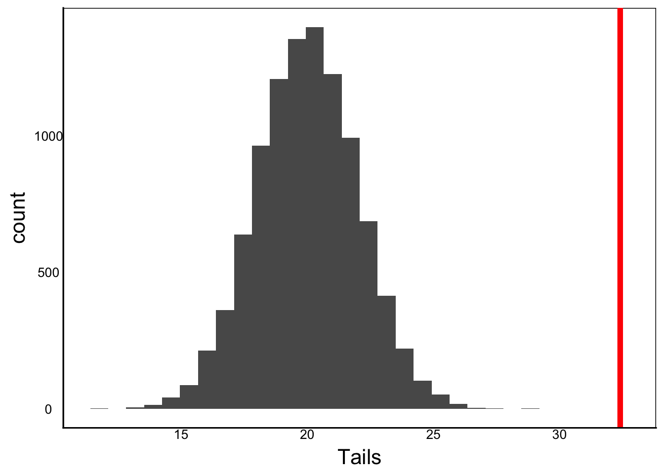
We can see that the observed value is way beyond any of our sampled values, so intuitively it looks like we would reject the null hypothesis. But how do we calculate the p-value, the probability that we would observe this length of 100 given the study population?
The probability is just the area under the sample distribution that includes the observed value. A simple way to do this, is to look at that number of values that overlap the observed value.
Question: How can we code this in R?
One simple one is to use a logic operator on each observation to determine which simulated values overlap the observation, then sum them together and divide by the total to get a proportion:
sum(Tails > 32.4)/length(Tails)[1] 0Note that the ‘true’ probability is never quite zero, but can be too small to calculate accurately. In this case, our individual has a longer tail length then any of the lizars in the large sample.
Question: What is the probability that the null hypothesis is true?
Answer: Keep reading to find out…
A more common way to do this is to transform the data to z-scores. The z-distribution is a Gaussian distribution with a mean of zero and standard deviation of 1. Let’s say we sample 1,000 of our lizard population, and then standardize the tail lengths to z-scores, which is a simple equation:
\[ z_i = \frac{x_i-\bar x}{s}\]
In other words, to calculate the z-score for each individual \(z_i\) :
Here is the raw data for this sample population:
N<-1000
Tails<-rnorm(n=N, mean=20, sd=2)
x<-mean(Tails)
sd<-sd(Tails)
se<-sd/sqrt(N)
CI<-c(x-1.96*se, x+1.96*se)
print(CI[2]-CI[1])
[1] 0.2436768ggplot() + geom_histogram(aes(x=Tails),bins=30)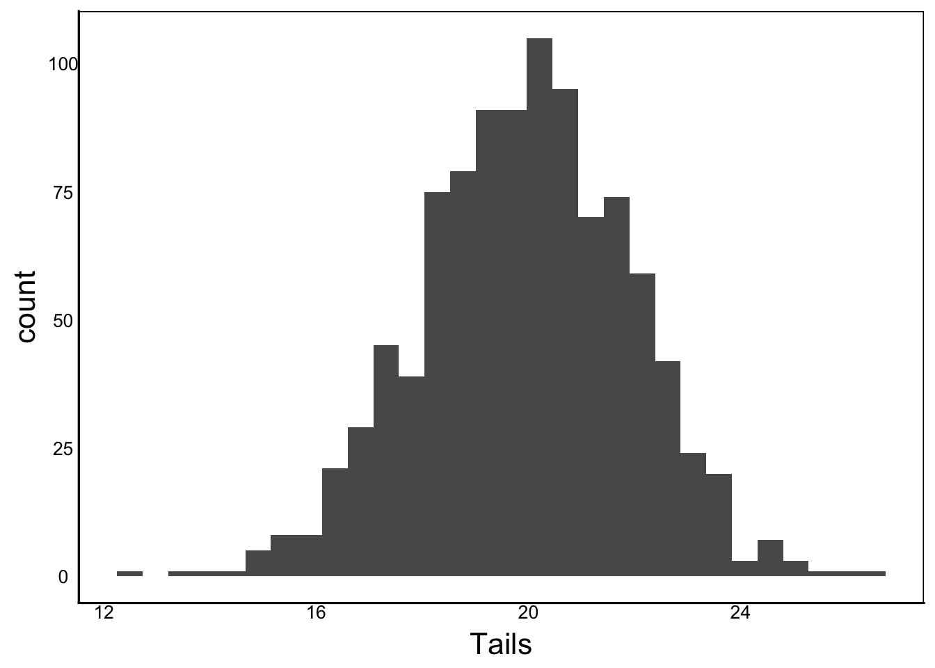
And the z-scores:
zTails<-(Tails-mean(Tails))/sd(Tails)
ggplot() + geom_histogram(aes(x=zTails),bins=30)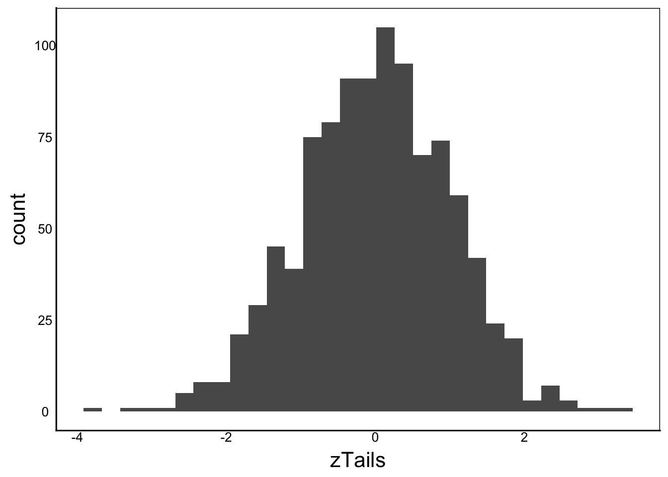
Make sure to check your brackets so that you subtract each observation from the mean before dividing by sd. It is a very common mistake to have brackets in the wrong place, and it can be tricky to troubleshoot.
Compare the zTails histogram of z-scores with the original `Tails`` histogram. Notice how the shape of the figure is identical to the original data, with only the x-axis scale changed?
Now if we want to test whether the lizard with tail length 32.4 comes from the same population as our sample, we have to transform 32.4 to a z-score using the sample mean and sd:
zLiz<-(32.4-mean(Tails))/sd(Tails)
print(zLiz)
[1] 6.336333ggplot() +
geom_histogram(aes(x=zTails)) +
geom_vline(xintercept=zLiz,colour=I("red"),size=I(2))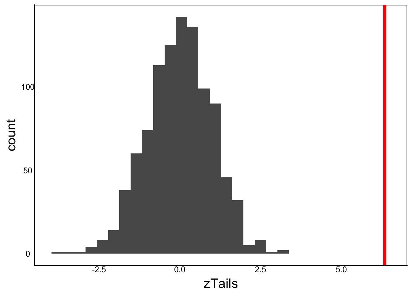
One big advantage of z-scores is that it provides a universal scale in units of standard deviation, which can be useful for comparing different measurements. Some common examples in biology include: comparing phenotypic selection acting on different traits, meta-anlyses comparing different studies, and metabolomic analysis of different analytes with different concentrations.
Visually this looks like good evidence for a different species since there is no visible overlap with the study sample. But we also know that the human brain is always trying to find patterns, so we need a more formal test. There are two options here depending on our hypothesis.
The 2-tail test simply asks whether the observed value is different than we would expect from a random sample of the study population. It does not make a prediction about whether the value would be higher or lower.
\(H_0 =\) The observation is NOT DIFFERENT from the population
The 1-tail test requires a directional prediction, for example, what is the probability that this sample is larger than expected from a random sample of the study population.
\(H_0 =\) The observation is NOT BIGGER than the population
OR
\(H_0 =\) The observation is NOT SMALLER than the population
Once we define the test, we simply quantify the area of overlap between the sample and the null distribution.
At this point, you might be asking:
“How do I know when to do a one-tailed or two-tailed test?”
Which is really just another way of asking:
“Is my prediction directional?”
The difference often comes down to whether you have a firm theoretical foundation for making directional predictions. In most cases, however it is easier to use a two-tailed test.
A two-tailed test is usually more conservative and doesn’t require a prediction about direction.
One problem with what we have done so far is that we are treating our large sample as the population. A large sample is often a good approximation of the population, but what if our sample is small or if we need higher precision in our estimate or p-value? For example, maybe we are running a simulation or model and we want to calculate an exact p-value. R has some handy functions we can use.
pnorm()Calculating the area under a Gaussian curve is easy to do in R by using the pnorm function:
?pnormNote the different parameters compared to rnorm. The key differences are:
lower.tail – provides a probability that the observed value is lower (TRUE) or higher (FALSE) than expected by chance. This means the area to the left (i.e., lower values) or right (i.e., higher values) of the reference point.q – the vector of quantiles. This is just the vector of the observations that we wish to test. Let’s run pnorm to test our observed tail length (32.4) against a normally distributed population with mean and sd equal to our sample population.pnorm(q=32.4, mean=mean(Tails) ,sd=sd(Tails), lower.tail=F)[1] 1.176492e-10This is the probability of observing a value of 32.4 or greater when drawing a random value from a Gaussian distribution with the mean and standard deviation of our sample population. Note that the ‘or greater’ is because we set lower.tail=F. If we set it to T then we would get the probability of observing a value of 32.4 or less.
We can also do this with our z-scores:
pnorm(q=zLiz, mean=0, sd=1, lower.tail=F)[1] 1.176492e-10Note that we get the same p-value because we earlier defined zLiz as:
\[32.4-\frac{mean(Tails)}{sd(Tails)}\]
In both cases, the value is a probability ranging from 0 to 1.
EXERCISE: Try changing
sdandqto understand how the probability changes depending on the variance of the population and the difference between the observation and the population mean.
The only difference between a 1-tail and 2-tail test is that we divide the probability (p-value) by 2 for a 2-tailed test to account for the fact that our null hypothesis allowed the observation to be larger OR smaller than the population mean. The 1-tail hypothesis specifies an a priori prediction about the observation. Don’t confuse this with the lower.tail parameter, which defines the part of the curve to calculate the probability area, though the two are related.
All of our examples in this section assume that we know the characteristics of our population, or that we can approximate them from a very large sample. But what if we don’t know the population characteristics? What if we have two or more samples of lizards and we want to see whether they came from the same statistical population – or more accurately, populations with the same mean and standard deviation?
We need a test statistic.
Thanks to the Central Limit Theorem, we can calculate test statistics that we can use for statistical inference.
Some common statistics include \(t\) for Student’s t-test, \(\chi ^2\) for the goodness-of-fit test, and \(F\) for ANOVA and regression. We’ll focus on \(t\) for the rest of this chapter, but the same principles apply to comparing other statistical distributions.
The t-test is a common statistical test and comes in two flavours: one sample and two samples – not to be confused with the one-tail and two-tail tests that we just looked at.
The one-sample t-test allows us to test whether a sample differs significantly from a defined mean. In our case, we might have captured 100 lizards and we want to know if they came from a population with a mean tail length of 20.
The \(t\) statistic just compares the sample mean \(\bar x\) with the population mean \(\mu\).
\[ t = \frac {\bar x - \mu}{SE_x} \]
Notice the similarity to the z-score calculation above, but instead of a z-score for an individual, we calculate a single \(t\) value for the sample. Instead of sd of the population, we substitute SE of the sample. We need to define the population mean that we are testing against, and calculate the standard error of the 100 test lizards.
If our expected mean is zero then the \(t\)-statistic simplifies to the sample mean divided by the standard error. Indeed, this is a very common use for the one sample t-test. For example, if we wanted to test whether a weight-loss strategy differs from zero, or whether the presence of a predator alters behaviour of a prey away from a baseline of zero.
The \(t\) equation solves another problem with the z-score example above: we need a very large sample size to accurately characterize the mean and standard deviation of our study population, otherwise our calculated p-value is unreliable. With the t-test, the uncertainty of our mean and standard deviation estimates become part of the probability calculation.
The final step applies the Central Limit Theorem to compare the observed t-value against the range of values we would expect from a randomly drawn sample. Once again, we need to compare the observed value against a null distribution, but this time we can use the pt function for the t-distribution, instead of pnorm.
Looking at the \(t\) equation, we can see that the value of \(t\) increases when the observed mean (\(\bar x\)) differs from the mean defined by the null hypothesis (\(\mu\)), which is often zero, but doesn’t have to be. The magnitude of the difference in the equation is tempered by the standard error, which is just the standard deviation divided by the square root of the sample size. So, a larger standard deviation will shrink the value of \(t\) relative to a small one, and a larger sample size will increase \(t\) relative to a smaller one. This implies a good rule of thumb:
Rule of thumb: Bigger sample sizes have more power, but with diminishing returns.
The two-sample t-test compares the means of two samples (e.g. \(x\) and \(y\)), to test the null hypothesis that:
$H_0 = $ Sample \(x\) and sample \(y\) are randomly drawn from the same population.
Instead of comparing one mean to a null expectation, we compare the two means to each other. Which standard error do we use? Both!
\[ t = \frac{\bar x -\bar y}{\sqrt{(SE_x)^2 + (SE_y)^2}} \]
The denominator is called the pooled standard error because we pool the standard error of both samples by first squaring them, then adding them together, befor taking the square root.
So far we have looked at sample distributions and population distributions. Statistical distributions are another type of distribution based on expected values from random draws. In the old days, we would compare our observed \(t\) to a table of \(t\) values to calculate a p-value. Today we can do this faster and more accurately in R with the t.test function, which will do all of the above steps for us!
The first thing we should do is carefully read the help for t.test in R and look at the key parameters:
?t.testNotice that we have vectors of data x and y (optional) as well as mu, which is the mean for the one-sample test (\(\mu\)) or the difference in means for the two-sample test (\(\bar x - \bar y\)). Take a moment to think about that becaus eit can be a common source of error in R. The same parameter has different meanings, depending on the other parameters of the function. Notice that the default for mu is set to zero.
One other important parameter is alternative, which is analogous to the one-tailed and two-tailed tests that we examined earlier.
Let’s create two vectors of data to explore the t.test function, staying with our example of lizard tail lengths.
Species1<-c(20,15,17,23,19,15)
Species2<-c(23,20,32,18,24,32)We can separately test whether each species came from a population (i.e. species) with a mean tail length of 20
t.test(x=Species1, mu=20)
    One Sample t-test

data:  Species1
t = -1.437, df = 5, p-value = 0.2102
alternative hypothesis: true mean is not equal to 20
95 percent confidence interval:
 14.88701 21.44633
sample estimates:
mean of x
18.16667 t.test(x=Species2, mu=20)
    One Sample t-test

data:  Species2
t = 1.9908, df = 5, p-value = 0.1031
alternative hypothesis: true mean is not equal to 20
95 percent confidence interval:
 18.59235 31.07431
sample estimates:
mean of x
 24.83333
Let’s take a moment to look carefully at the output. It specifies what data we use, the calculated t statistic, the degrees of freedom (df), and and the p-value.
It also gives us the confidence interval and the mean of the sample. Notice that the 95% confidence interval overlaps our population mean \(\mu\) and the p-value is not significant. These are telling us the same thing: the sample mean is not significantly different from 20.
We can include a second vector of data in the t.test function, which will automatically cause the function to run the two-sample t-test, to test the null hypothesis that the two samples came from the same underlying statistical population.
t.test(x=Species1, y=Species2)
    Welch Two Sample t-test

data:  Species1 and Species2
t = -2.4307, df = 7.5659, p-value = 0.04284
alternative hypothesis: true difference in means is not equal to 0
95 percent confidence interval:
 -13.0549973  -0.2783361
sample estimates:
mean of x mean of y
 18.16667  24.83333
Compare the output with the one-sample tests. Note the Welch in the title. This indicates an adjustment to the t-test, which we can read about if we search for ‘Welch’ in the the help file. Reading the help file you can see this adjustment applies a correction, which explains why the degrees of freedom (df) is not a whole number.
The paired t-test is a variation of the two-sample t-test. Sometimes our data can be paired in some way. For example, we might apply two different treatments to the same individual, or we might pair two individuals from the same family, class or group. In our lizard example, we might take a male and female egg from each mother and then see if their tail lengths differ. Let’s make a sample dataset for 6 mothers, each with one female and one male offspring:
# Code for unique mother
TLen<-data.frame(Mother=c("a","b","c","d","e","f"),
                 # Tail length of son (male)
                 mLen=c(28,30,15,12,19,22),
                 # Tail length of daughter (female)
                 fLen=c(30,29,17,16,23,26))
str(TLen)
'data.frame': 6 obs. of 3 variables:
$ Mother: chr "a" "b" "c" "d" ...
$ mLen : num 28 30 15 12 19 22
$ fLen : num 30 29 17 16 23 26Note the special setup of this data.frame object: each row is a different mother, with mLen and fLen columns representing different individuals (i.e., a male and a female offspring from each mother).
Again we use the t.test function, but this time we specify paired=true
t.test(x=TLen$mLen,y=TLen$fLen,paired=T)
    Paired t-test

data:  TLen$mLen and TLen$fLen
t = -3.1009, df = 5, p-value = 0.02683
alternative hypothesis: true mean difference is not equal to 0
95 percent confidence interval:
 -4.5724693 -0.4275307
sample estimates:
mean difference
           -2.5
Compare to the unpaired, two-sample t-test:
t.test(x=TLen$mLen,y=TLen$fLen,paired=F)
    Welch Two Sample t-test

data:  TLen$mLen and TLen$fLen
t = -0.66072, df = 9.7079, p-value = 0.5242
alternative hypothesis: true difference in means is not equal to 0
95 percent confidence interval:
 -10.965202   5.965202
sample estimates:
mean of x mean of y
     21.0      23.5
Why such a big difference in p-value? Let’s compare the groups:
mean(TLen$mLen) # mean males[1] 21sd(TLen$mLen)/sqrt(length(TLen$mLen)) # SE males[1] 2.898275mean(TLen$fLen) # mean females[1] 23.5sd(TLen$fLen)/sqrt(length(TLen$mLen)) # SE females[1] 2.43242The means are different, but the confidence intervals overlap. For example, larger mothers might lay larger eggs that produce larger offspring. This would be an example of a maternal effect, which is common in plants and animals. In this case, maternal families may vary a lot in the size of offspring. A paired t-test accounts for the variation among lizard mothers before testing for a difference in the mean between male and female eggs.
Every statistical test has assumptions. It’s important to know these assumptions and to make sure your data conform to the assumptions, otherwise your p-value can be meaningless.
A key assumption for the t-test is that the population follows a Gaussian distribution. We know this is true for data created with rnorm but we don’t know if it’s true for most real-world data.
In the next chapter, we’ll look at central moments as a method for characterizing distributions to look for departures from the Gaussian distribution.