library(ggplot2) # plotting libraryWarning: package 'ggplot2' was built under R version 4.5.2library(dplyr) # data management
source("http://bit.ly/theme_pub") # Set custom plotting theme
theme_set(theme_pub())In the previous chapter, we reviewed the basic structure of linear models, which have a single continuous response or dependent variable and one or more predictor or independent variables. We walked through some specific examples, noting how they are all special cases of the linear model. In this chapter, we expand into more complex linear models by looking at Interactions among predictor variables. Shen we say Interaction term in statistics, we are usually referring to a very specific set of terms in a statistical model. Interpreting these interactions are slightly different for different kinds of predictors (i.e. continuous vs categorical).
We will explore interaction terms with code to develop a better understand of what they are. We then turn to the problem of collinearity (i.e. correlations) among predictors, why this poses a challenge for statistical models, and what we can do to deal with it.
Finally, we will explore false-positive results, which becomes a bigger and bigger problem as we increase the complexity of our models by adding more predictors and interaction terms. This is a common problem with ‘big data’.
Load libraries and custom plotting theme
library(ggplot2) # plotting libraryWarning: package 'ggplot2' was built under R version 4.5.2library(dplyr) # data management
source("http://bit.ly/theme_pub") # Set custom plotting theme
theme_set(theme_pub())First, we will generate some predictor variables, like we did in the last chapter.
set.seed(234)
TestDat<-data.frame(
  PredCon=rnorm(1000),
  PredNom=sample(c("A","B"),1000,replace=T),
  Err=rnorm(1000)
)
Now we set up our response variable.
Beta0<-10 # Intercept
Beta1<-1.3 # Slope of the continuous predictor
TestDat<-TestDat %>%
  # Means of the categorical predictor
  mutate(PredNomMean=recode(PredNom,"A"=0,"B"=1))
Interaction terms in a linear model are sometimes referred to as non-additive effects, because they represent deviations from what would be expected under an additive model. As a simple example, imagine that we are testing the interaction of two drugs on the growth of lab mice.
Question: If Drug #1 increases growth by 10 grams (g) and Drug #2 increases growth by 25 g, how much growth would we expect in mice treated with both Drug #1 and Drug #2?
Answer: If you said 35, then you are assuming an additive model.
But what if mice injected with both drugs actually increased growth by only 30 gs or only 5 g? That would be a negative or antagonistic effect, because the average is less than what would be expected under the additive model. If both drugs together increased growth by 40 g or 100 g, then the effect would be positive or synergistic.
You can imagine similar scenarios if we look at the dose of each drug as a continuous effect – a linear relationship between dose and growth. Then we have additive effects, or negative/antagonistic effects if the slope is less than additive, or positive/synergistic effects if the slope is greater than predicted.
Finally, we might consider an interaction between a continuous variable (e.g. dose of drug 1) with a categorical variable (e.g. mouse species). In this case, an interaction would be additive if the slope of the drug effect was the same for both species, but a non-additive interaction is not necessarily synergistic or antagonistic. Instead, a significant interaction just tells us that the two groups have different slopes. We’ll explore these scenarios in more detail below.
In the linear model framework, we can simply define a new variable that is a combination of two or more variables. Any model with two or more predictors has the potential for interaction terms. The interaction term means that we multiply the two values together and then by a new coefficient. So the value of each observation (\(i\)) of our response variable (\(Y\)) can be defined in terms of predictor variables \(X_1\) and \(X_2\):
\[ Y_i \sim \beta_0 + \beta_1 X_{1,i} + \beta_2 X_{2,i} + \beta_3X_{1,i}X_{2,i} + \epsilon_i\]
So we can calculate our response variable and add it to the data set.
First, calculate the response without the interaction. Then, add a separate slope for group B.
Beta3=1.2
TestDat<-TestDat %>%
  mutate(Resp=recode(
    PredNom,"A" = Beta0 +
      Beta1 * PredCon +
      PredNomMean +
      Err,
    "B" = Beta0 +
      Beta1 * PredCon +
      PredNomMean +
      Beta3 * PredCon +
      Err))
Using the lm function in R, we denote the interaction using a colon :.
Mod1<-lm(Resp~PredCon+PredNom+PredCon:PredNom, data=TestDat)
anova(Mod1)
Analysis of Variance Table
Response: Resp
Df Sum Sq Mean Sq F value Pr(>F)
PredCon 1 3567.9 3567.9 3451.62 < 2.2e-16 ***
PredNom 1 209.7 209.7 202.89 < 2.2e-16 ***
PredCon:PredNom 1 357.0 357.0 345.40 < 2.2e-16 ***
Residuals 996 1029.5 1.0
---
Signif. codes: 0 '***' 0.001 '**' 0.01 '*' 0.05 '.' 0.1 ' ' 1summary(Mod1)
Call:
lm(formula = Resp ~ PredCon + PredNom + PredCon:PredNom, data = TestDat)

Residuals:
    Min      1Q  Median      3Q     Max
-3.3156 -0.6893  0.0062  0.6885  2.9622

Coefficients:
                 Estimate Std. Error t value Pr(>|t|)
(Intercept)      10.03521    0.04668  214.98   <2e-16 ***
PredCon           1.31816    0.04569   28.85   <2e-16 ***
PredNomB          0.94391    0.06441   14.66   <2e-16 ***
PredCon:PredNomB  1.21437    0.06534   18.59   <2e-16 ***
---
Signif. codes:  0 '***' 0.001 '**' 0.01 '*' 0.05 '.' 0.1 ' ' 1

Residual standard error: 1.017 on 996 degrees of freedom
Multiple R-squared:  0.8006,    Adjusted R-squared:    0.8
F-statistic:  1333 on 3 and 996 DF,  p-value: < 2.2e-16
Note in the above output how the interaction term gets its own test statistic. Looking at the Estimate column in the summary we can see that PredNomA is missing, meaning that it is the overall intercept, PredCon is the slope of the continuous variable for the A group ONLY. The mean for group B is our mean of group B added to our overall intercept (0.94 + 10 = 10.94). To get the equation for the B group, we take the intercept of 10.94 and to get the slope of group B we add the interaction term to the slope for group A (1.21 + 1.32).
Question: Did you understand that? Take a minute to work through the above paragraph, to make sure you understand what each estimate corresponds to.
In short, the interaction in this specific model represents a different slope for the two groups. We can use ggplot to visualize this interaction.
ggplot(aes(x=PredCon,y=Resp, group=PredNom),data=TestDat) +
  geom_point(aes(colour=PredNom)) + geom_smooth(method="lm")
`geom_smooth()` using formula = 'y ~ x'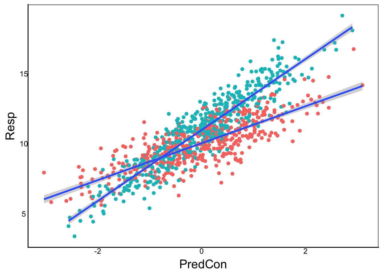
The geom_smooth() function fits separate lines for each of the group= categories in the ggplot function. We can see the steeper slope an higher intercept for the B group (remember that the intercept is the value of \(Y\) when \(x=0\)).
The above example is for one categorical + one continuous, but what if we have two categorical variables?
TestDat<-TestDat %>%
  mutate(PredNom2 = sample(c("Hot","Cold"),1000, replace=T)) %>%
  mutate(PredNom2Mean = recode(PredNom2,"Hot"=2,"Cold"=0)) %>%
  mutate(RespCat = recode(
    PredNom2,"Hot" = Beta0 + PredNomMean + PredNom2Mean + Err,
    "Cold" = Beta0 + PredNomMean + PredNom2Mean +
Beta3*PredNomMean*PredNom2Mean + Err))Mod2<-lm(RespCat ~ PredNom + PredNom2 + PredNom:PredNom2,
data=TestDat)
anova(Mod2)Analysis of Variance Table
Response: RespCat
Df Sum Sq Mean Sq F value Pr(>F)
PredNom 1 234.05 234.05 226.964 <2e-16 ***
PredNom2 1 1074.66 1074.66 1042.121 <2e-16 ***
PredNom:PredNom2 1 1.72 1.72 1.666 0.1971
Residuals 996 1027.10 1.03
---
Signif. codes: 0 '***' 0.001 '**' 0.01 '*' 0.05 '.' 0.1 ' ' 1summary(Mod2)
Call:
lm(formula = RespCat ~ PredNom + PredNom2 + PredNom:PredNom2,
    data = TestDat)

Residuals:
    Min      1Q  Median      3Q     Max
-3.3021 -0.6872  0.0178  0.6763  2.9488

Coefficients:
                     Estimate Std. Error t value Pr(>|t|)
(Intercept)          10.04084    0.06667 150.605   <2e-16 ***
PredNomB              0.85746    0.09257   9.263   <2e-16 ***
PredNom2Hot           1.98767    0.09321  21.324   <2e-16 ***
PredNomB:PredNom2Hot  0.16612    0.12870   1.291    0.197
---
Signif. codes:  0 '***' 0.001 '**' 0.01 '*' 0.05 '.' 0.1 ' ' 1

Residual standard error: 1.015 on 996 degrees of freedom
Multiple R-squared:  0.5606,    Adjusted R-squared:  0.5593
F-statistic: 423.6 on 3 and 996 DF,  p-value: < 2.2e-16
Looking at the summary, we can see that the intercept is calculated for Group A in the Cold treatment, with a mean of 10 for that group. All the other group means are calculated as deviations.
From the coefficients, we see the intercept is 10, then add 0.8 for anything with group B, 2.0 for any hot treatment and 0.17 for only the B group in the hot treatment. Specifically:
We can see the means with ggplot:
ggplot(aes(x=PredNom,y=RespCat,fill=PredNom2),
       data=TestDat)+
  geom_boxplot()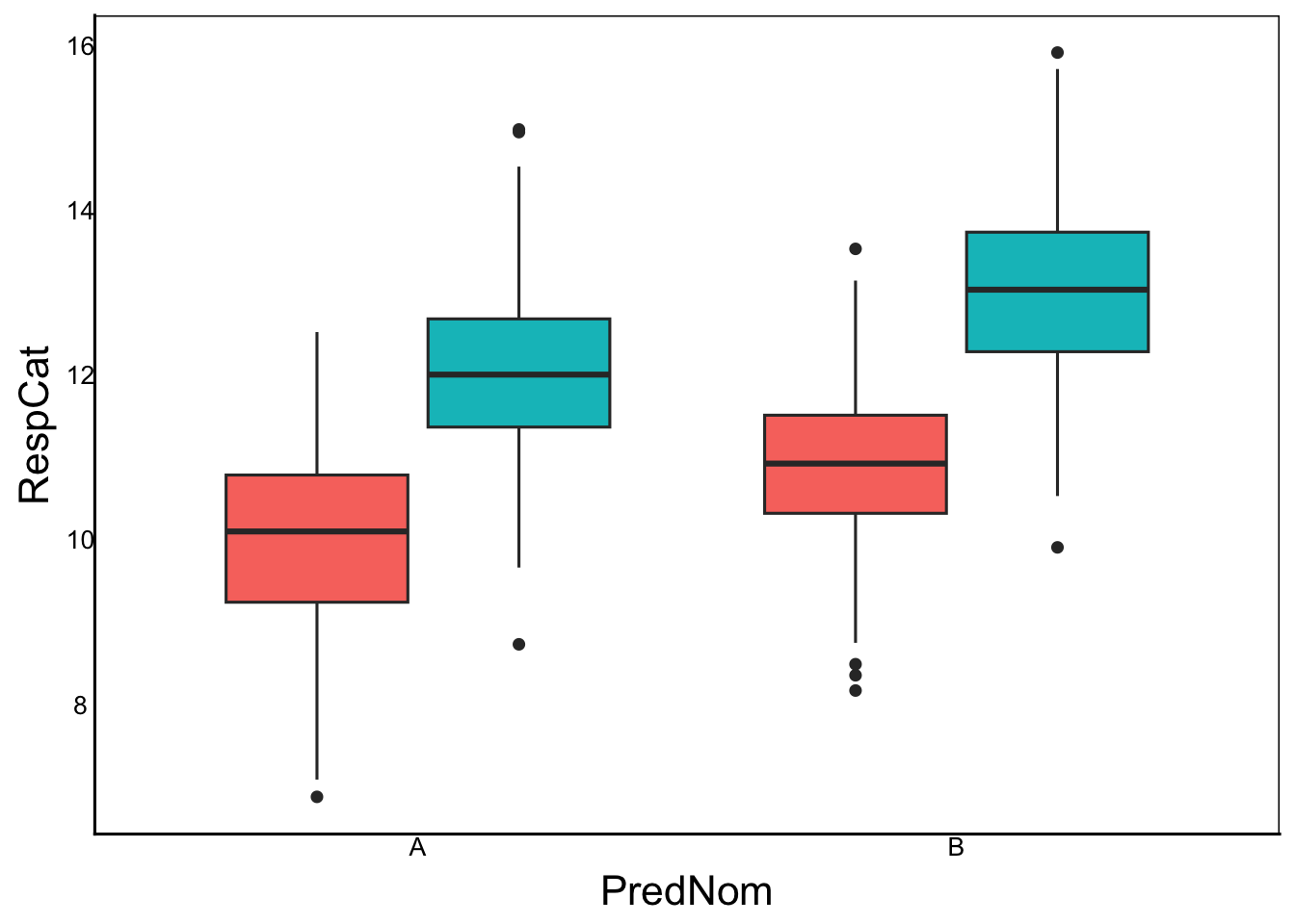
The interaction is a bit difficult to see here because the interaction term is small and non-significant. But in the output above we can see a small synergistic interaction (positive effect), meaning that group B in the hot treatment is slightly higher than expected under an additive model.
Let’s now consider two continuous predictors. This time it’s a bit easier to set up the data:
Beta2<- -2
TestDat<-TestDat %>%
  mutate(PredCon2=rnorm(1000)) %>%
  mutate(RespCon=Beta0 + Beta1*PredCon + Beta2*PredCon2 +
Beta3*PredCon*PredCon2 + Err)Mod3<-lm(RespCon ~ PredCon + PredCon2 + PredCon:PredCon2,
data=TestDat)
anova(Mod3)Analysis of Variance Table
Response: RespCon
Df Sum Sq Mean Sq F value Pr(>F)
PredCon 1 1581.5 1581.5 1537.2 < 2.2e-16 ***
PredCon2 1 4154.9 4154.9 4038.6 < 2.2e-16 ***
PredCon:PredCon2 1 1422.6 1422.6 1382.8 < 2.2e-16 ***
Residuals 996 1024.7 1.0
---
Signif. codes: 0 '***' 0.001 '**' 0.01 '*' 0.05 '.' 0.1 ' ' 1summary(Mod3)
Call:
lm(formula = RespCon ~ PredCon + PredCon2 + PredCon:PredCon2,
    data = TestDat)

Residuals:
    Min      1Q  Median      3Q     Max
-3.3249 -0.6989  0.0035  0.6817  3.0681

Coefficients:
                 Estimate Std. Error t value Pr(>|t|)
(Intercept)      10.00880    0.03212  311.56   <2e-16 ***
PredCon           1.32705    0.03263   40.66   <2e-16 ***
PredCon2         -1.99329    0.03171  -62.85   <2e-16 ***
PredCon:PredCon2  1.12890    0.03036   37.19   <2e-16 ***
---
Signif. codes:  0 '***' 0.001 '**' 0.01 '*' 0.05 '.' 0.1 ' ' 1

Residual standard error: 1.014 on 996 degrees of freedom
Multiple R-squared:  0.8748,    Adjusted R-squared:  0.8744
F-statistic:  2320 on 3 and 996 DF,  p-value: < 2.2e-16
Again, we see the interaction term in the Estimate column, but now the overall intercept is 10, because we only have 1 grouping variable. The slope for the PredCon variable is 1.3 and now we also have the slope for PredCon2 (NOTE: -2 is the slope, not the deviation in slope). Finally, we have the interaction term that we set at 1.2.
The interaction term for two continuous variables is more difficult to visualize than the two previous cases. This is a good example of how math can be so useful, as a single term can explain this fairly complex relationship.
Let’s plot out our two continuous predictor variables and then scale/colour the points based on the predicted value from the model:
ggplot(aes(x=PredCon,y=PredCon2),data=TestDat) +
  geom_point(aes(colour=predict(Mod3),size=predict(Mod3)),
             alpha=0.3)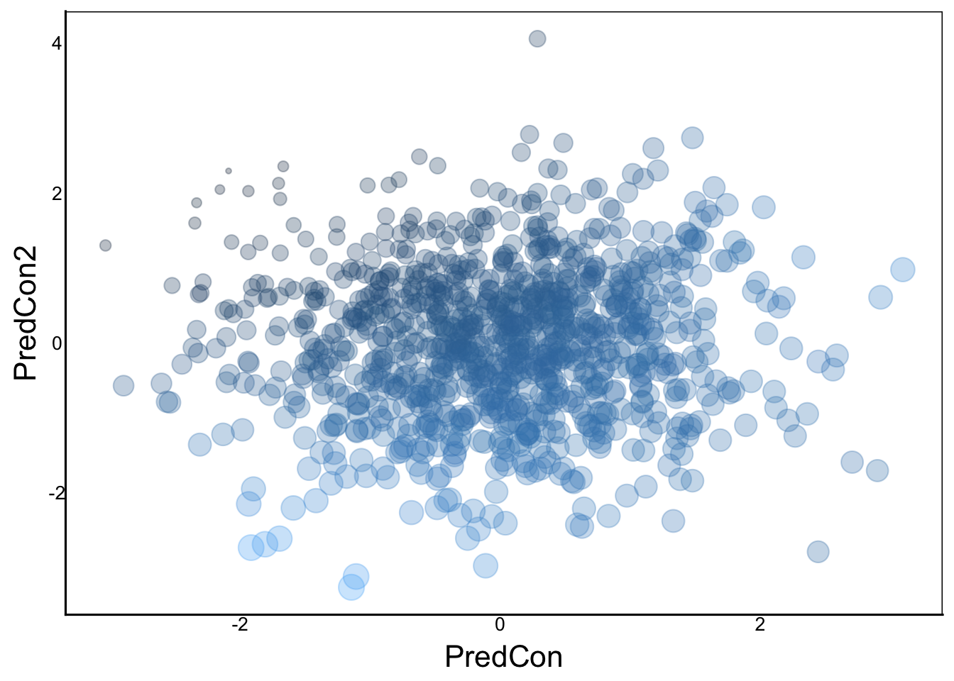
You can see that the smallest points are in the top left and the largest are in the bottom right. This is what we expect given the slopes, but there is a bit of curvature that we can see with the larger points in the top right and bottom left.
Another way to visualize and conceptualize this interaction is by setting different values for one of the continuous variables to see how the slope changes. In this case, we will calculate the slope of the regression when our second predictor is at -2, 0 and +2:
ggplot(aes(x=PredCon,y=RespCon,colour=PredCon2),data=TestDat) +
  geom_point() +
  # when PredCon2 = 0
  geom_abline(intercept=10,slope=1.3+1.2*(0),colour="yellow") +
  # when PredCon2 = -2
  geom_abline(intercept=10,slope=1.3+1.2*(-2),colour="red") +
  # when PredCon2 = 2
geom_abline(intercept=10,slope=1.3+1.2*(2),colour="green") 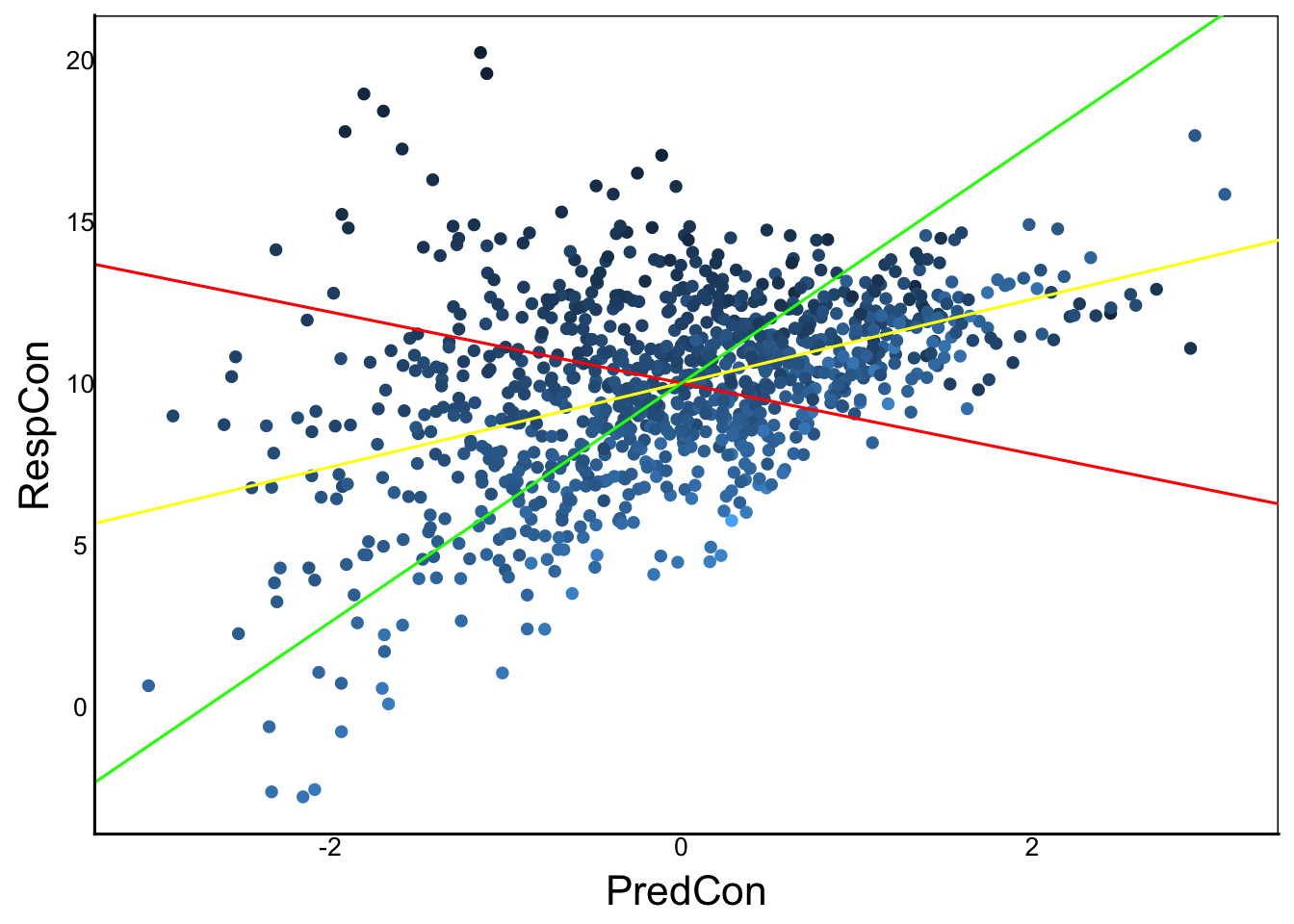
: vs *)In larger linear models, we may have multiple predictors with 2-way or 3-way interactions. It can become very long to write out all the individual terms and there interactions. For example, if we have 3 predictors \(X_1\), \(X_2\) and \(X_3\) we would have to write:
lm(Y ~ X1 + X2 + X3 +
     X1:X2 + X1:X3 + X2:X3 +
     X1:X2:X3)
We can use the shorthand * in lm to represent the interaction AND its individual terms. So, the above model could be written simply as:
lm(Y ~ X1*X2*X3)From this example, we can also see how complicated our models can get as we add more predictors with more interaction terms.
Take a minute to think about how hard it would be to add third variable with 3-way interactions to the examples we covered above. It can get very tricky to interpret 3-way interactions, but here is a handy trick that you can use.
Consider the interaction term A:B:C with each letter representing a continuous or categorical variable. If there is at least one categorical variable, then a significant 3-way interaction tells you that you can run independent models. For example, let’s say A represents three experimental groups. If there is a significant 3-way interaction, then you can just create separate data.frame objects for each group, and run simpler 2-way interaction models for each of the three groups, giving you 3 models in total. If you have more than one categorical variable, for example if A and B are both categorical, then you can choose to split either into different groups from A or B. It doesn’t matter which, so you can just choose the one that makes the most sense to you.
Collinearity occurs when two or more variables have similar predictive value. An easy way to think about this is when you have one predictor variable that is a function of two or more variables. One way to test for collinearity, is to calculate the correlations among predictor variables. If you have high correlation then you should think if/how you can exclude one of the variables.
One very important case of collinearity occurs when one or more variables are just combinations of others. This can be a big problem, but luckily we can detect it in the model output. Here’s an example:
B<-rnorm(1000)
C<-rnorm(1000)
A<-B+C
cor(A,B)
[1] 0.7086975cor(A,C)[1] 0.7314255Notice in our code how A is completely determined by the additive effects of B and C, yet there is enough variability in each that the correlation is not too close to 1, so we might not be suspicious yet. However, if we put all of these in a linear model, we can see the problem:
Y<-10+0.2*B+1.2*C+rnorm(100)
Mod6<-lm(Y ~ A + B + C)
summary(Mod6)
Call:
lm(formula = Y ~ A + B + C)

Residuals:
     Min       1Q   Median       3Q      Max
-2.51903 -0.62650  0.06878  0.61155  2.27745

Coefficients: (1 not defined because of singularities)
            Estimate Std. Error t value Pr(>|t|)
(Intercept) 10.07191    0.02936  343.02   <2e-16 ***
A            1.21347    0.02813   43.14   <2e-16 ***
B           -0.96941    0.04122  -23.52   <2e-16 ***
C                 NA         NA      NA       NA
---
Signif. codes:  0 '***' 0.001 '**' 0.01 '*' 0.05 '.' 0.1 ' ' 1

Residual standard error: 0.9282 on 997 degrees of freedom
Multiple R-squared:  0.663, Adjusted R-squared:  0.6623
F-statistic: 980.7 on 2 and 997 DF,  p-value: < 2.2e-16
Notice the NA in our predictor, which is a red flag in the output of any linear model. In this case, we get estimates for A and B, so adding C into the model adds no predictive power because C = A-B.
Another problem can occur when two predictors are highly correlated, but not completely co-linear. This time we will do a similar model but add a very small amount of residual error with rnorm.
A<-B+C+rnorm(1000,sd=0.001)

Y<-10+0.2*B+1.2*C+rnorm(100)
Mod6<-lm(Y ~ A + B + C)
summary(Mod6)
Call:
lm(formula = Y ~ A + B + C)

Residuals:
     Min       1Q   Median       3Q      Max
-2.16145 -0.76807  0.04323  0.78215  2.46021

Coefficients:
             Estimate Std. Error t value Pr(>|t|)
(Intercept)   9.97899    0.03152 316.573   <2e-16 ***
A           -36.90452   31.69805  -1.164    0.245
B            37.05603   31.69973   1.169    0.243
C            38.11566   31.69733   1.202    0.229
---
Signif. codes:  0 '***' 0.001 '**' 0.01 '*' 0.05 '.' 0.1 ' ' 1

Residual standard error: 0.9963 on 996 degrees of freedom
Multiple R-squared:  0.624, Adjusted R-squared:  0.6228
F-statistic: 550.9 on 3 and 996 DF,  p-value: < 2.2e-16
In this case we don’t get any NA values, but note how the P-values for A, B and C are all non-significant. But we know they should be significant because of the way we defined them. Indeed, they are significant if we analyze them in separate models:
summary(lm(Y~A))
Call:
lm(formula = Y ~ A)

Residuals:
    Min      1Q  Median      3Q     Max
-4.0108 -0.8844  0.0011  0.9088  3.6592

Coefficients:
            Estimate Std. Error t value Pr(>|t|)
(Intercept)  9.96772    0.03958   251.9   <2e-16 ***
A            0.69816    0.02675    26.1   <2e-16 ***
---
Signif. codes:  0 '***' 0.001 '**' 0.01 '*' 0.05 '.' 0.1 ' ' 1

Residual standard error: 1.251 on 998 degrees of freedom
Multiple R-squared:  0.4057,    Adjusted R-squared:  0.4051
F-statistic: 681.2 on 1 and 998 DF, p-value: < 2.2e-16summary(lm(Y~B))
Call:
lm(formula = Y ~ B)

Residuals:
    Min      1Q  Median      3Q     Max
-4.9844 -1.0793 -0.0098  1.1077  5.0100

Coefficients:
            Estimate Std. Error t value Pr(>|t|)
(Intercept)  9.94841    0.05094  195.29  < 2e-16 ***
B            0.19629    0.05047    3.89 0.000107 ***
---
Signif. codes:  0 '***' 0.001 '**' 0.01 '*' 0.05 '.' 0.1 ' ' 1

Residual standard error: 1.611 on 998 degrees of freedom
Multiple R-squared:  0.01493,   Adjusted R-squared:  0.01395
F-statistic: 15.13 on 1 and 998 DF, p-value: 0.000107summary(lm(Y~C))
Call:
lm(formula = Y ~ C)

Residuals:
     Min       1Q   Median       3Q      Max
-2.45012 -0.75920  0.02874  0.77057  2.74176

Coefficients:
            Estimate Std. Error t value Pr(>|t|)
(Intercept)  9.97956    0.03186  313.19   <2e-16 ***
C            1.21739    0.03050   39.91   <2e-16 ***
---
Signif. codes:  0 '***' 0.001 '**' 0.01 '*' 0.05 '.' 0.1 ' ' 1

Residual standard error: 1.007 on 998 degrees of freedom
Multiple R-squared:  0.6148,    Adjusted R-squared:  0.6144
F-statistic:  1593 on 1 and 998 DF,  p-value: < 2.2e-16
Now compare the estimates of each individual model with the corresponding estimates in the full model. The separate models are simple linear regression estimates, whereas the full model represents partial linear regression estimates. The word partial is a mathematical term that means ‘while holding other factors constant’.
The reason partial regression estimates are are not significant in the combined model is that they are too tightly correlated. There is not enough parameter space covered by the points to accurately estimate the slope of each variable while controlling for the others.
Try plotting the three pairwise scatterplots to see the problem. Parameter space is the total area in the three graphs – how much of that area is represented by the points?
The best way to deal with collinearity is to think carefully about which predictor variables to include in your model. If a predictor variable can itself be predicted by one or more other predictor variables, then it’s best to just choose one, and exclude the others from the model. Deciding which variable to exclude depends on the specific biology of the system you are studying. There is no simple formula you can use, unfortunately.
Principal Component Analysis (PCA) can be a very useful tool for collinear variables, by ‘collapsing’ several correlated variables into a few principal component predictors.
Sometimes predictors are ALMOST collinear, but there is enough variation to test which predictor is a better predictor. We can do this with model selection.
Model selection also solves another problem: when we have many potential models, we can get significant models just by chance. For example, if we run 100 models on completely random data, we would expect about 5 models, on average, to be significant at p < 0.05.
Here’s a more concrete example. A colleague of yours learns about linear models and decides to use them to find genes that promote or impede tumor growth. Using a large database they find a whopping 5,000 genes associated with tumor growth. They are particularly excited about a subset of 100 genes with p < 0.01
But you see the problem right away. Knowing that their dataset contains 100,000 SNPs (i.e. bp differences) from 10 million participants, you can calculate the False Discovery Rate (FDR). If you run 100,000 statistical tests, you expect 5% to have a p < 0.05 and 1% to have p < 0.01 – that’s 5,000 and 1,000 single nucleotide polymorphisms (SNPs) that are significant, even though they have no biological effect in reality.
A more general definition of the FDR applies to any model with a prediction and an observed (true) value. Think of a clinical test for Lyme disease as an example. The test is our model, from which we predict the status of the patient. The patient either has Lyme (positive) or not (negative) and the test is either accurate (true) or inaccurate (false). Thus, there are four possibilities:
The false discovery rate is mathematically defined as
\[ FDR = \frac{FP}{FP+TP}\]
In addition to FDR, we can calculate the overall accuracy of the model as the number of true predictions divided by the total. It is often expressed as a %
\[ Accuracy = \frac{TP + TN}{TP + TN + FP + FN} \times 100 \% \]
In addition to accuracy of the overall model, we can subdivide the performance of the model into sensitivity and specificity.
Sensitivity is the the number of true positives divided by the total positives. It answers the question “What percent of positive outcomes (e.g. uninfected individuals) are correctly predicted by the model?”
\[ Sensitivity = \frac{TP}{TP+FN} \times 100 \%\]
Specificity is the inverse of sensitivity, in that it measures the number of accurate positive results. It answers the question “How specific is the test?” If a test is not specific, then we will get many false positives.
\[ Specificity = \frac{TN}{TN+FP} \times 100 \%\]
Question: If you had a choice between a test with high specificity OR high sensitivity, when would you choose one over the other?