library(ggplot2) # plotting library
library(dplyr) # data management

source("http://bit.ly/theme_pub") # Set custom plotting theme
theme_set(theme_pub())Linear Models
Introduction
Linear models are the workhorse of statistical inference in Biology. These models come in many forms and act as a foundation for more complex statistics. This means that there is a lot of ground to cover, and it will be important to have a solid foundation of understanding of basic linear models before moving into more sophisticated analyses.
The terminology and methods can quickly get confusing. From the Analysis of Variance (ANOVA) and linear regression to more complicated models like polynomial regression, multiple regression, multifactor ANOVA, and Analysis of Co-variance (ANCOVA). It’s important to be familiar with these terms so that you can engage with other researchers in the ‘real world’ but in fact they all have the same function.
All of the above examples are specific cases of Linear Models. In R, basic linear models are run with the lm() function. By focusing on the code, it will be easy to see how all these fancy model names are really a set of related models that differ only in number and type of predictor variables (i.e. independent variables). In all basic linear models, the response variable (i.e. dependent variable) is a continuous variable.
Setup
Load libraries and our custom plotting theme.
Structure
In the ggplot tutorial in the R Crash Course book, we looked at visualizations for individual and paired data.
We saw that data types can come in a few flavours. In statistical models, we think of data in slighlty different terms:
- Binary – Boolean variables with two possible states, such as 1 or 0, true/false, yes/no
- Nominal – Variables with two or more categories (e.g. treatment)
- Continuous – Measurements that can take on a range of values (e.g. height)
- Ordinal – Discrete categories but ordered in some way (e.g. number of offspring)
Different types of linear models (e.g. ANOVA or Regression) are defined by the type of input data they use. Importantly, Linear Models have two types of input:
- Response (a.k.a. Dependent) variables – these are the data columns that we are trying to predict.
- Predictor (a.k.a. Independent) variables – these are the data columns that we are using to make predictions.
Linear Models will always have one continuous response variable, but it can have one or more predictor variables that may include a mix of binary, nominal and continuous variables. Ordinal variables are a bit more tricky, and will be treated as (approximately) nominal or continuous variables, depending on the nature of the data.
Formula
To understand the syntax of a linear model, look at the help:
?lmThere are just two main components; the rest we can keep as default values:
- formula – this is how we define the model
- data – the data.frame object we are analyzing
The formula for linear models looks like this:
Response ~ Predictor(s)
You just have to remember the tilde (~) and which side to put your predictor vs response variables. The terminology of these models is unfortunately confusing.
Terminology
Linear models (LM) can be extended in two ways, albeit with confusing terminology. First, General Linear Models allow for more than one response variable. However, a key assumption is that the response variables are independent of each other. For example, let’s say you want to run an LM to predict the movement speed of a study organism (e.g. bird, fish, nematode) when experiencing two different environmental stimuli. In this case, each row of data would be a different individual, and you would have two response variables for each individual: movement speed under stimulus #1 and stimulus #2. You want to use a General Linear Model to predict both behaviours from a common set of predictors, like body mass, age, sex, etc.
But what if the behaviour in stimulus 2 depends on the behaviour in stimulus 1? For example, there could be a negative correlation if a high movement rate in stimulus 1 makes the individual tired or acclimated so that it has a lower movement in stimulus 2. In cases like this, the response variables are dependent, so a general linear model would be inappropriate. Instead, we would use a Generalized Linear Model (GLM). We will explore GLMs later. I know, this is confusing terminology – a general liner model is different from a generalized linear model.
Visualizing Types
Let’s start by looking at a single response variable and a single predictor. Our response will always be a continuous variable in a Linear Model. Similar to the ggplot tutorial, we can organize our linear models based on the type of predictor.
To visualize these models, let’s first create some data for each type of response variables:
Continuous
Our continuous response variable (Y)
set.seed(123)
Y<-rnorm(1000)
A continuous response variable (Xcon)
set.seed(234)
Xcon<-rnorm(1000)
Nominal
A categorical response variable (Xcat).
We can use the sample function ?sample
set.seed(345)
Xcat<-sample(c("A","B","C"),1000, replace=T)
Ordinal
What about ordinal data? There are more advanced models that can handle this kind of data but we can also run them in a linear model if we make a choice whether to treat it as categorical or continuous.
For example, if we were looking at offspring numbers in Canadian moose, most would have 0, 1 or 2, but some would have 3 or more. We could recode every observation into one of 4 categories: 0, 1, 2, 3+ and analyze offspring number as a categorical variable.
Another example, if we look at the nubmer of seeds on the head of a dandelion, we might find that the distribution follows a normal or log-normal distribution. In that case we can treat it as a continuous variable – possibly taking the log before using it in our linear model.
Linear Regression
Linear regression uses a continuous predictor
Continuous Response ~ Continuous Predictor
pDat<-as.data.frame(cbind(Xcon,Y))
CCplot<-ggplot(aes(x=Xcon, y=Y), data=pDat) +
  geom_point()
In linear regression, we want to find a straight line that fits to the majority of data. We can visulaize this using geom_smooth()
CCplot + geom_smooth(method="lm")`geom_smooth()` using formula = 'y ~ x'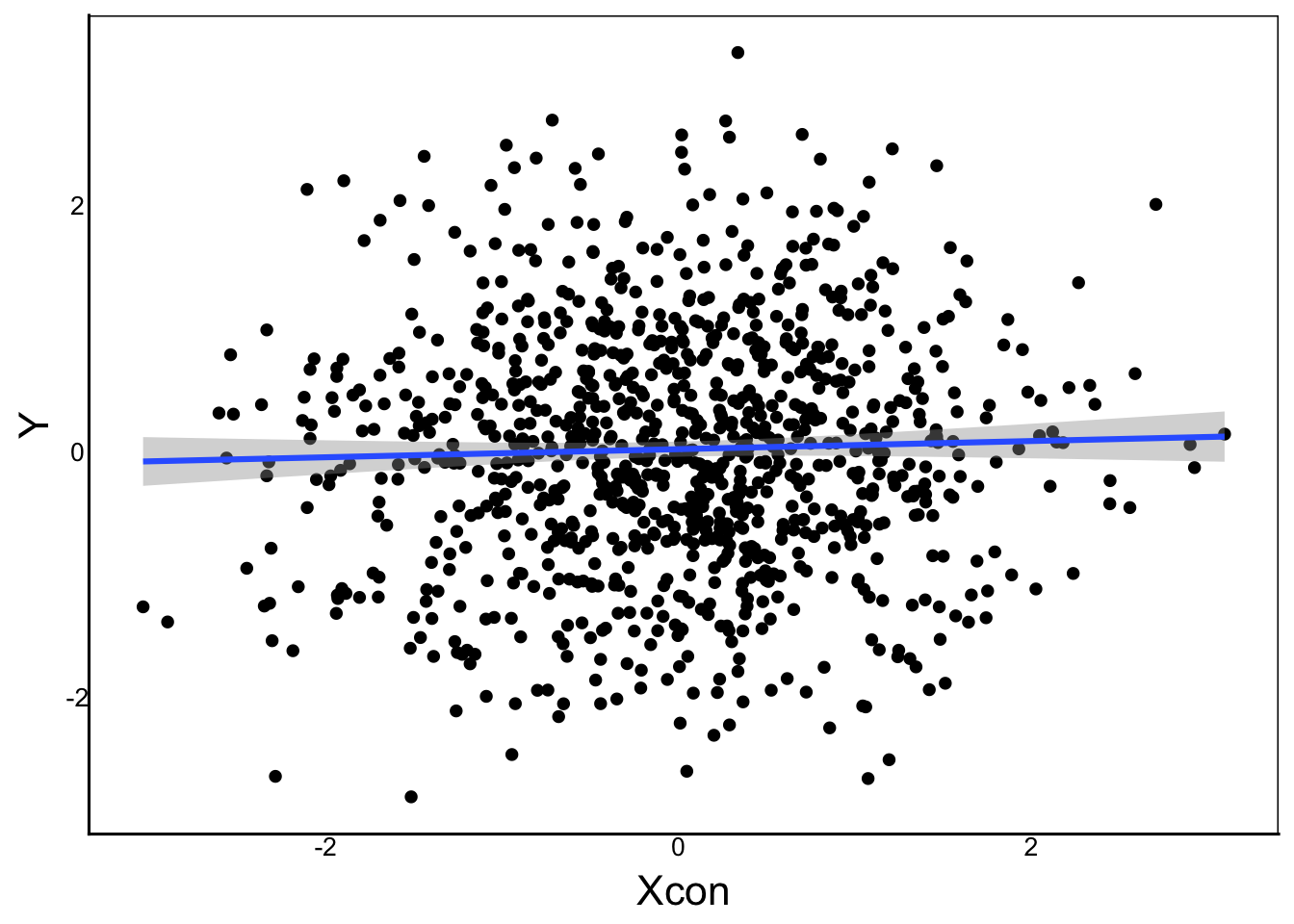
Is this line different than one we would generate by chance? It should be, since we generated two independent random variables. If this were real data, we would not know that, so we could use a linear model to test the relationship.
lm(Y ~ Xcon)
Call:
lm(formula = Y ~ Xcon)

Coefficients:
(Intercept)         Xcon
    0.01684      0.03298
The default output of the lm function is not too informative. It just shows us the input formula and then the estimated coefficients. There are some additional functions to extract more information about the model, which we can find in the help documentation for lm:
LinReg<-lm(Y ~ Xcon)
summary(LinReg)
Call:
lm(formula = Y ~ Xcon)

Residuals:
    Min      1Q  Median      3Q     Max
-2.7766 -0.6543 -0.0101  0.6544  3.2131

Coefficients:
            Estimate Std. Error t value Pr(>|t|)
(Intercept)  0.01684    0.03137   0.537    0.591
Xcon         0.03298    0.03186   1.035    0.301

Residual standard error: 0.9917 on 998 degrees of freedom
Multiple R-squared:  0.001073,  Adjusted R-squared:  7.187e-05
F-statistic: 1.072 on 1 and 998 DF,  p-value: 0.3008
Let’s break down the input, particularly the coefficients and the statistics in the last three lines of output.
Predictions
The Estimate column gives us the equation for the line of best fit, with the intercept and slope. Recall the linear equation:
\[ y = mX + b \]
In the mathematics of linear models, this exact same equation is usually written as:
\[ Y_i \sim \beta_0 + \beta_1 X_i\]
In this equation, \(\beta_0\) and \(\beta_1\) are constants, \(X_i\) is a vector containing the predictor variable, \(Y_i\) is the vector containing the response variable. In the output of our model, we see the intercept (_0) is 0.017 and the slope (_1) is 0.33.
These values are the equation for the predicted line, which would be okay if every single observation fell exactly on the line of best fit. We can plot for comparison:
CCplot + geom_abline(slope=0.033, intercept=0.017, colour="red")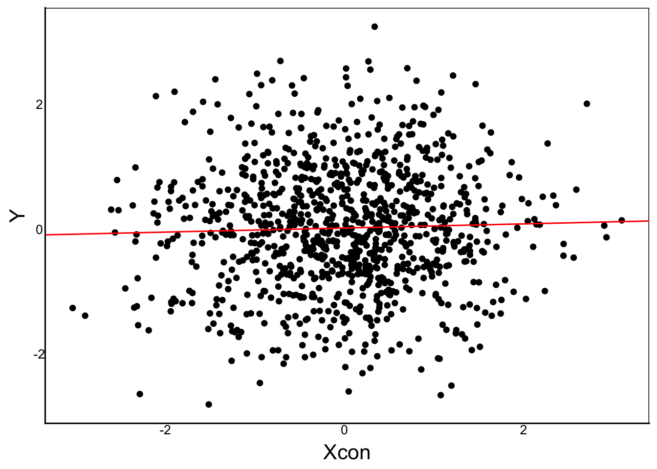
The red line that we added is the same as the lm line added from geom_smooth.
We can also make specific predictions for each observation:
Predicted<- 0.033*Xcon + 0.017
CCplot + geom_point(aes(y=Predicted), colour="red")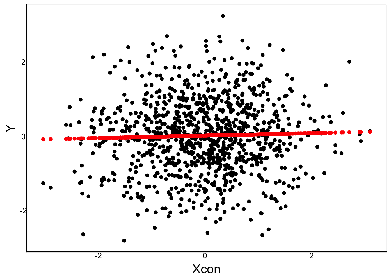
However, Wwe can see that most observations do not fall on the line of best fit. To fully describe the relationship between Y and X, we need to account for the deviation of each point from the line.
Residual Error
This is called the error term or residual error:
\[ \epsilon_i = Observed_i - Predicted_i \]
In other words, we:
- Look at each point
- Record the observed value on the y-axis
- Look at the predicted value on the y-axis (the line of best fit)
- Subtract the observed value from the predicted
Resid<-Y-Predicted
head(Resid)
[1] -0.599281048 -0.179429050 1.591182114 0.004957699 0.064136164
[6] 1.693440399Accounting for this error fully describes each point, giving the full Linear Model equation:
\[ Y_i = \beta_0 + \beta_1 X_i + \epsilon_i\]
Our linear model has three important vectors:
Predictor \(X_i\)
Take a minute to review and make sure you understand this. The \(Y_i\) is the observed value of our response variable. The subscript \(i\) represents an individual value, which tells us that \(Y\) is a vector of values.
Response \(Y_i\)
Similarly, the \(X_i\) is the observed value of our predictor variable, with the same subscript, meaning that \(X\) is also a vector, and each value of \(i\) in \(X\) has a corresponding value in \(Y\). This is really just analyzing values from the same row in a dataframe with columns \(Y\) and \(X\).
Residual Error \(\epsilon_i\)
Similarly, \(\epsilon\) is also a vector. This vector represents the difference between the observed Y and the predicted Y from our model. This is known as the vector of residuals or residual error. We can calculate these directly as we did earlier, or we can get these from our lm object with the residuals() function.
LinResid<-residuals(LinReg)
head(LinResid)
1 2 3 4 5 6
-0.599107663 -0.179313246 1.591309668 0.005148279 0.064326488 1.693602736 Compare with our calculation above:
head(Resid)[1] -0.599281048 -0.179429050 1.591182114 0.004957699 0.064136164
[6] 1.693440399Significance
Looking again at our linear regression output, we can see that each estimate has its own standard error , t-value and p-value.
LinReg<-lm(Y ~ Xcon)
summary(LinReg)
Call:
lm(formula = Y ~ Xcon)

Residuals:
    Min      1Q  Median      3Q     Max
-2.7766 -0.6543 -0.0101  0.6544  3.2131

Coefficients:
            Estimate Std. Error t value Pr(>|t|)
(Intercept)  0.01684    0.03137   0.537    0.591
Xcon         0.03298    0.03186   1.035    0.301

Residual standard error: 0.9917 on 998 degrees of freedom
Multiple R-squared:  0.001073,  Adjusted R-squared:  7.187e-05
F-statistic: 1.072 on 1 and 998 DF,  p-value: 0.3008
In our Distributions Chapter, we looked at the t-test equation for a mean and standard error. That same equation can be applied to the estimate and standard error for the slope and intercept, under the null hypothesis that slope = 0 and intercept = mean(Y).
We can also see the Adjusted R-squared value, which is very close to zero. This R-squared value is an estimate of the amount of variation explained by the statistical model, ranging from 0 (no variation explained) to 1 (100% explained).
The F-statistic tests the overall fit of the model. In this case you can see that our model is not significant. We can see this more clearly using the anova function
anova(LinReg)Analysis of Variance Table
Response: Y
Df Sum Sq Mean Sq F value Pr(>F)
Xcon 1 1.05 1.05400 1.0718 0.3008
Residuals 998 981.42 0.98339 Let’s try to make a significant model by creating a predictor that is related to the response. A simple way is to make the \(Y\) a function of \(X\) and then add a random error value to each observation:
CorPred<-Y+rnorm(length(Y))
CorMod<-lm(Y ~ CorPred)Question: Why is
length(Y)in the code?
Now we can run the model and visualize:
pDat<-as.data.frame(cbind(CorPred,Y))
ggplot(aes(x=CorPred,y=Y), data=pDat) +
  geom_point() +
  geom_smooth(method="lm")
`geom_smooth()` using formula = 'y ~ x'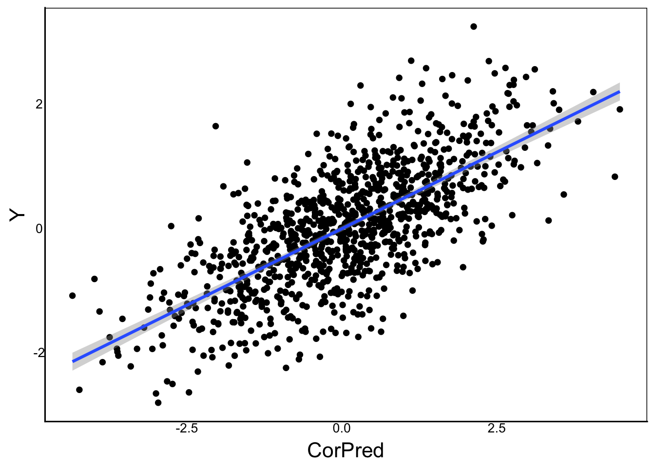
summary(CorMod)
Call:
lm(formula = Y ~ CorPred)

Residuals:
     Min       1Q   Median       3Q      Max
-1.96917 -0.44505 -0.02051  0.47141  2.65104

Coefficients:
            Estimate Std. Error t value Pr(>|t|)
(Intercept) -0.01044    0.02246  -0.465    0.642
CorPred      0.49200    0.01595  30.855   <2e-16 ***
---
Signif. codes:  0 '***' 0.001 '**' 0.01 '*' 0.05 '.' 0.1 ' ' 1

Residual standard error: 0.7098 on 998 degrees of freedom
Multiple R-squared:  0.4882,    Adjusted R-squared:  0.4877
F-statistic: 952.1 on 1 and 998 DF, p-value: < 2.2e-16anova(CorMod)Analysis of Variance Table
Response: Y
Df Sum Sq Mean Sq F value Pr(>F)
CorPred 1 479.66 479.66 952.05 < 2.2e-16 ***
Residuals 998 502.81 0.50
---
Signif. codes: 0 '***' 0.001 '**' 0.01 '*' 0.05 '.' 0.1 ' ' 1Compare these outputs carefully to the previous data. We get a significant slope but not a significant intercept, based on the t-tests of the estimates.
We also get a highly significant F-test and our model explains almost 50% of the variation.
ANOVA
Let’s look at a linear model with a categorical predictor.
CatMod<-lm(Y ~ Xcat)
ggplot() +
  geom_boxplot(aes(x=Xcat, y=Y))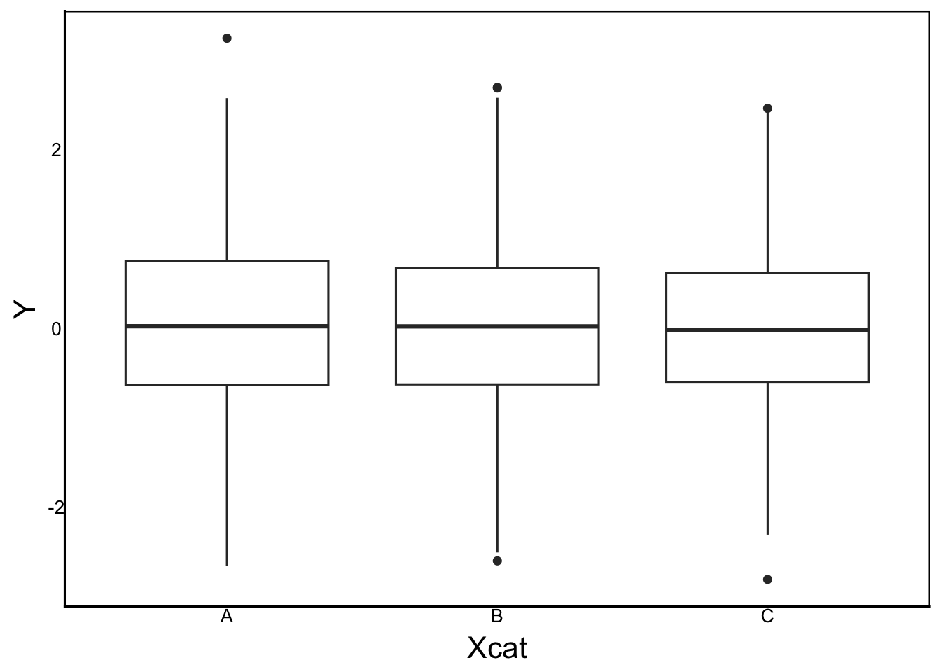
summary(CatMod)
Call:
lm(formula = Y ~ Xcat)

Residuals:
    Min      1Q  Median      3Q     Max
-2.7911 -0.6442 -0.0092  0.6606  3.1999

Coefficients:
            Estimate Std. Error t value Pr(>|t|)
(Intercept)  0.04109    0.05574   0.737    0.461
XcatB       -0.01377    0.07721  -0.178    0.859
XcatC       -0.05981    0.07759  -0.771    0.441

Residual standard error: 0.9924 on 997 degrees of freedom
Multiple R-squared:  0.0006628, Adjusted R-squared:  -0.001342
F-statistic: 0.3306 on 2 and 997 DF,  p-value: 0.7186
Similar to linear regrssion we have an estimate column, and for each estimate we also have standard error, t-value and probability.
We also have R-squared and F-values describing the fit of the model, along with an overall p-value for the model.
BUT there is one important difference. Our predictor variable \(X_i\) is categorical in this model, rather than continuous. So how do we get from a categorical predictor to an estimated slope?
We have 3 categories: A, B, C and we also have 3 estimates: (Intercept), XcatB, and XcatC
We can define 3 categories using 2 binary variables.
RecodeDat<-data.frame(Response=Y,
                      PredGroup=Xcat) %>%
  mutate(XcatB=recode(Xcat,"A"=0,"B"=1,"C"=0),
XcatC=recode(Xcat,"A"=0,"B"=0,"C"=1))Question: Why no XcatA?
Answer: We know that Xcat=A when XcatB=0 AND XcatC=0.
Any predictor with N categories can be recoded into N-1 binary columns
Check that the data are recoded properly
head(RecodeDat) Response PredGroup XcatB XcatC
1 -0.56047565 A 0 0
2 -0.23017749 C 0 1
3 1.55870831 C 0 1
4 0.07050839 C 0 1
5 0.12928774 A 0 0
6 1.71506499 B 1 0And run the model
RecLM<-lm(Response ~ XcatB + XcatC, data=RecodeDat)
summary(RecLM)
Call:
lm(formula = Response ~ XcatB + XcatC, data = RecodeDat)

Residuals:
    Min      1Q  Median      3Q     Max
-2.7911 -0.6442 -0.0092  0.6606  3.1999

Coefficients:
            Estimate Std. Error t value Pr(>|t|)
(Intercept)  0.04109    0.05574   0.737    0.461
XcatB       -0.01377    0.07721  -0.178    0.859
XcatC       -0.05981    0.07759  -0.771    0.441

Residual standard error: 0.9924 on 997 degrees of freedom
Multiple R-squared:  0.0006628, Adjusted R-squared:  -0.001342
F-statistic: 0.3306 on 2 and 997 DF,  p-value: 0.7186
and compare to the original ANOVA
summary(CatMod)
Call:
lm(formula = Y ~ Xcat)

Residuals:
    Min      1Q  Median      3Q     Max
-2.7911 -0.6442 -0.0092  0.6606  3.1999

Coefficients:
            Estimate Std. Error t value Pr(>|t|)
(Intercept)  0.04109    0.05574   0.737    0.461
XcatB       -0.01377    0.07721  -0.178    0.859
XcatC       -0.05981    0.07759  -0.771    0.441

Residual standard error: 0.9924 on 997 degrees of freedom
Multiple R-squared:  0.0006628, Adjusted R-squared:  -0.001342
F-statistic: 0.3306 on 2 and 997 DF,  p-value: 0.7186
This is equivalent to taking the deviation of the means:
A<-RecodeDat %>%
  filter(PredGroup=="A") %>%
  summarize(mean(Response))
B<-RecodeDat %>%
  filter(PredGroup=="B") %>%
  summarize(mean(Response))
C<-RecodeDat %>%
  filter(PredGroup=="C") %>%
  summarize(mean(Response))

A
mean(Response)
1 0.04109208B-A mean(Response)
1 -0.01376664C-A mean(Response)
1 -0.05980686Let’s now look at the output of the anova function
anova(CatMod)Analysis of Variance Table
Response: Y
Df Sum Sq Mean Sq F value Pr(>F)
Xcat 2 0.65 0.32558 0.3306 0.7186
Residuals 997 981.82 0.98478 Notice how there is now just a single predictor (Xcat) with 2 degrees of freedom, rather than separate predictors for each binary subcategory.
The equation for this ANOVA can be written the same as the regression model:
\[ Y_i = \beta_0 + \beta_{j} X_{j,i} + \epsilon_{i}\]
We just have to keep in mind that \(X_{j,i}\) is a nominal variable with N categories recoded as N-1 binary variables. The \(j\) underscore represents each of these variables. Again, you can visualize a data frame with N-1 columns containing 0 or 1 in each row, and \(j\) represents the specific column of data, and \(i\) represents a specific row (i.e. individual).
\(\beta_0\) is the (Intercept) in the output and it shows the overall mean. In the output there are also the N-1 \(\beta_1\) terms specifying the deviation of each group mean from the Intercept. This is multiplied to the corresponding columns of 0 and 1, and all of these are added up to make the prediction.
NOTE: By default, the
lmfunciton chooses the category for \(\beta_0\) as the first in alphabetical order
Contrast this with a continuous variable where \(\beta_1\) is a single value for the slope, which is multiplied by \(X_i\), and the anova() output shows 1 degree of freedom.
2+ predictors
So far we have looked at models with a single predictor. What if we have 2 or more predictors?
We can simply add additional predictor \(X\) terms to our linear model
\[ Y_i = \beta_0 + \beta_1 X_{1,i} + \beta_2 X_{2,i} + \beta_jX_{j,i}... + \epsilon_i\]
There are a few specific ‘flavours’ of these models, as shown below. You should know these because they are still used in the scientific literature, but remember that they are just different combinations of predictor variables:
- ANCOVA – nominal + continuous predictors
- Multifactor ANOVA – 2 or more nominal predictors
- Multiple regression – 2 or more continuous predictors
- Polynomial regression – 1 or more continuous predictors raised to 2 or more exponents to produce non-linear predictions
Build-a-Model
Now that you understand the basic structure of a linear model, let’s build some using simulated data in R, with a few different parameters we can adjust to see how these changes affect the output of lm.
In the previous section, we made \(Y\) independent of \(X\) by randomly sampling \(Y\) from a normal distribution. In the models below, we will make \(Y\) dependent on the predictors by making \(Y\) a mathematical function of \(X\).
Next, we’ll do this for multiple predictors. In each case, we’ll look at the linear model equation, and code it in R.
ANCOVA
ANCOVA is short for ANalysis of COVariance, meaning it is is an ANOVA (nominal predictor \(cat\)) combined with a covariate (continuous predictor \(con\)).
\[ Y_i = \beta_0 + \beta_{cat} X_{cat,i} + \beta_{con} X_{con,i} + \epsilon_i\]
Let’s imagine a cancer drug trial where we want to test the effect of a drug (+ placebo) and we want to include age as a covariate. Our response variable would have to be a continuous measurement – let’s say tumor growth.
First, let’s create our predictor variables
N<-1000 # Sample Size
Beta0<-0 # Overall mean
BetaCon<-0.03 # Slope of our continuous variable
SimDat<-data.frame(
  # Treatment
  Treat=sample(c("Drug","Placebo"), N, replace=T),
  # Age (between 18 and 80 years)
  Age=sample(18:80, N, replace=T),
  # Individual error with a mean of 0 and sd of 1
  Err=rnorm(N, mean=0, sd=1)
) %>%
  # Means of treatments
  mutate(TreatMean=recode(Treat,"Drug"=0,"Placebo"=1.2))
head(SimDat)
Treat Age Err TreatMean
1 Placebo 32 -1.0249403 1.2
2 Placebo 56 -1.3919035 1.2
3 Placebo 63 0.8392222 1.2
4 Placebo 77 -1.0132896 1.2
5 Drug 38 1.1013809 0.0
6 Placebo 62 -0.3482810 1.2Now we just plug these data into our linear model equation to generate our dependent variable Growth. Then plot the data and run lm:
SimDat<-SimDat %>%
  mutate(Growth = Beta0 + TreatMean + BetaCon*Age + Err)

ggplot(aes(x=Age, y=Growth, colour=Treat),
       data=SimDat) +
  geom_point() +
  geom_smooth(method="lm")
`geom_smooth()` using formula = 'y ~ x'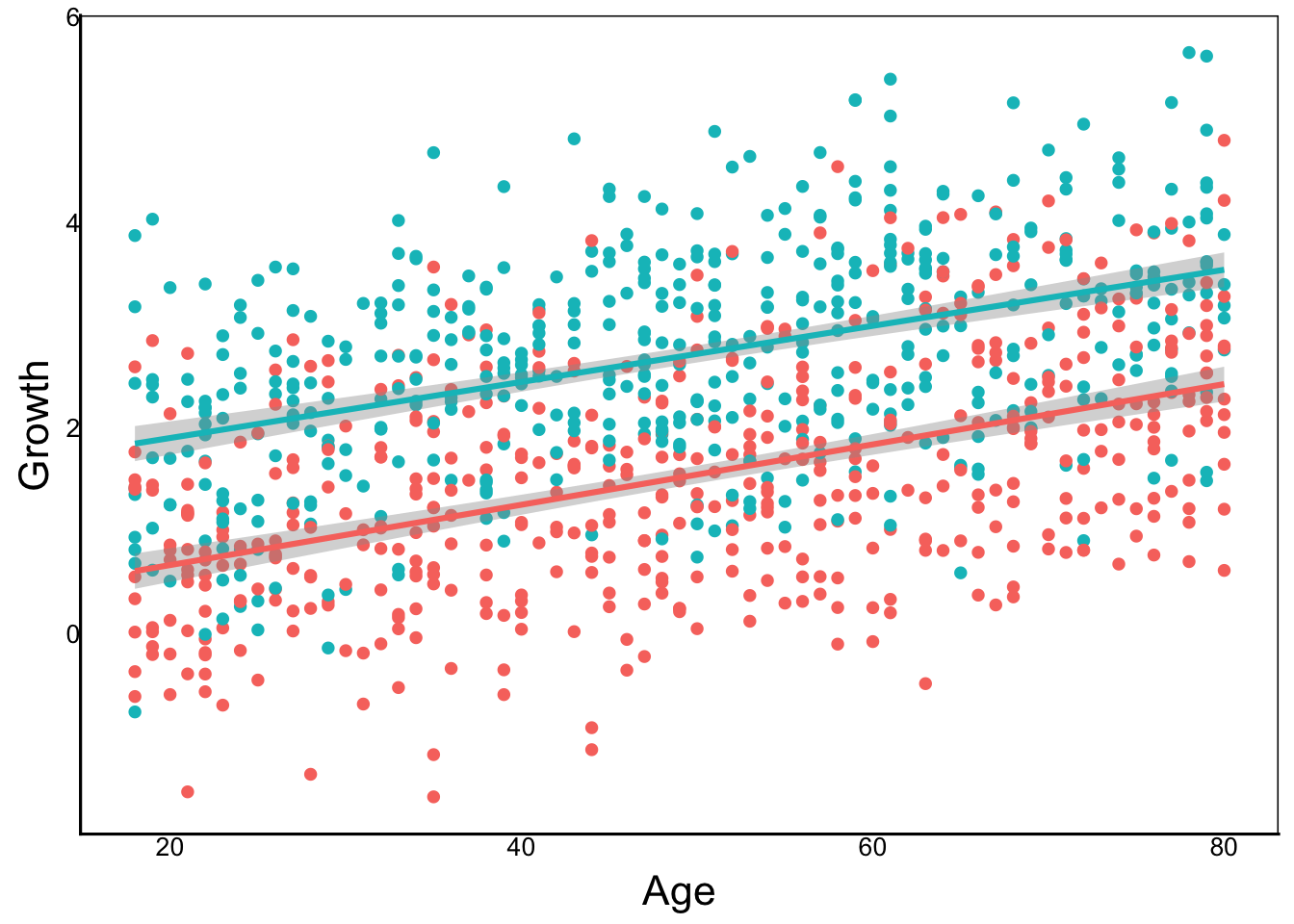
GrowthMod<-lm(Growth ~ Age + Treat, data=SimDat)
summary(GrowthMod)
Call:
lm(formula = Growth ~ Age + Treat, data = SimDat)

Residuals:
     Min       1Q   Median       3Q      Max
-2.71009 -0.68516  0.00184  0.65625  2.77062

Coefficients:
             Estimate Std. Error t value Pr(>|t|)
(Intercept)  0.122878   0.094807   1.296    0.195
Age          0.028373   0.001708  16.612   <2e-16 ***
TreatPlacebo 1.176208   0.061463  19.137   <2e-16 ***
---
Signif. codes:  0 '***' 0.001 '**' 0.01 '*' 0.05 '.' 0.1 ' ' 1

Residual standard error: 0.9718 on 997 degrees of freedom
Multiple R-squared:  0.3912,    Adjusted R-squared:   0.39
F-statistic: 320.3 on 2 and 997 DF, p-value: < 2.2e-16anova(GrowthMod)Analysis of Variance Table
Response: Growth
Df Sum Sq Mean Sq F value Pr(>F)
Age 1 259.16 259.16 274.40 < 2.2e-16 ***
Treat 1 345.86 345.86 366.21 < 2.2e-16 ***
Residuals 997 941.60 0.94
---
Signif. codes: 0 '***' 0.001 '**' 0.01 '*' 0.05 '.' 0.1 ' ' 1Try changing the parameters below re-running the code above. How does the graph and statstical output change?
N– Sample SizeBeta0– Overall meanBetaCon– Slope of our continuous variableErr=rnorm(..., mean=??, sd=??)– mean & sd of error termTreatMean=recode(Treat,"Drug"=??,"Placebo"=??))– Means of treatments
Multifactor ANOVA
A multifactor ANOVA is an analysis of variance with two or more categories. For example, if we wanted to test tumour growth from three treatments on male vs female mice.
\[ Y_i = \beta_0 + \beta_1 X_{1,i} + \beta_2 X_{2,i} + \epsilon_i\]
N<-1000 # Sample Size
Beta0<-0 # Overall mean
SimDat<-data.frame(
  # Treatment
  Treat=sample(c("Control","DrugA","DrugB","DrugC"),
               N, replace=T),
  # Sex
  Sex=sample(c("M","F"), N, replace=T),
  # Individual error with a mean of 0 and sd of 1
  Err=rnorm(N, mean=0, sd=1)
) %>%
  # Means of treatments
  mutate(TreatMean=recode(
    Treat,"Control"=0,"DrugA"=1.2,"DrugB"=-2,"DrugC"=0),
         SexMean=recode(
           Sex,"M"=0.5,"F"=0))
head(SimDat)
Treat Sex Err TreatMean SexMean
1 DrugA F 1.7310308 1.2 0.0
2 DrugA M -0.2693376 1.2 0.5
3 DrugB M 0.8458420 -2.0 0.5
4 Control M -0.9024574 0.0 0.5
5 Control F -0.9099187 0.0 0.0
6 Control M 1.1299475 0.0 0.5SimDat<-SimDat %>%
mutate(Growth = Beta0 + TreatMean + SexMean + Err)
ggplot(aes(x=Treat, y=Growth, fill=Sex),
data=SimDat) +
geom_boxplot()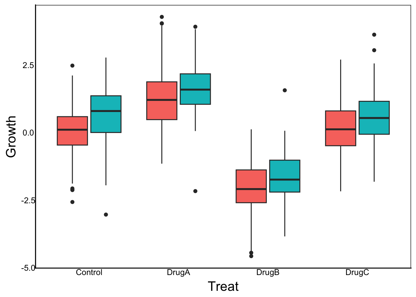
GrowthMod<-lm(Growth ~ Sex + Treat, data=SimDat)
summary(GrowthMod)
Call:
lm(formula = Growth ~ Sex + Treat, data = SimDat)

Residuals:
    Min      1Q  Median      3Q     Max
-3.8074 -0.6043 -0.0043  0.6214  3.1800

Coefficients:
            Estimate Std. Error t value Pr(>|t|)
(Intercept)  0.13261    0.06985   1.899   0.0579 .
SexM         0.46489    0.06272   7.412 2.65e-13 ***
TreatDrugA   1.04237    0.08681  12.007  < 2e-16 ***
TreatDrugB  -2.21853    0.08983 -24.696  < 2e-16 ***
TreatDrugC  -0.04354    0.08805  -0.495   0.6211
---
Signif. codes:  0 '***' 0.001 '**' 0.01 '*' 0.05 '.' 0.1 ' ' 1

Residual standard error: 0.9894 on 995 degrees of freedom
Multiple R-squared:  0.5954,    Adjusted R-squared:  0.5938
F-statistic: 366 on 4 and 995 DF, p-value: < 2.2e-16anova(GrowthMod)Analysis of Variance Table
Response: Growth
Df Sum Sq Mean Sq F value Pr(>F)
Sex 1 73.84 73.84 75.428 < 2.2e-16 ***
Treat 3 1359.54 453.18 462.902 < 2.2e-16 ***
Residuals 995 974.10 0.98
---
Signif. codes: 0 '***' 0.001 '**' 0.01 '*' 0.05 '.' 0.1 ' ' 1Multiple Regression
A multiple regression is just a regression with 2+ continuous predictors.
CHALLENGE: Make up an experiment with two continuous predictors and try to encode them as a linear model
\[ Y_i = \beta_0 + \beta_1 X_{1,i} + \beta_2 X_{2,i} + \epsilon_i\]
N<-1000 # Sample Size
Beta0<-0 # Overall mean
SlopeA<-0.3 # Slope for 1st continuous predictor
SlopeB<- -0.4 # Slope for 2nd continuous predictor
SimDat<-data.frame(
  TreatA=sample(0:100,N, replace=T),
  TreatB=sample(0:100,N, replace=T),
  # Individual error with a mean of 0 and sd of 1
  Err=rnorm(N, mean=0, sd=1)
) %>%
  mutate(Growth = Beta0 + SlopeA*TreatA + SlopeB*TreatB + Err)
Visualizing the model is tricky because we have two predictors now. We could plot each separately on the x-axis, or we could scale point size to one of them
ggplot(aes(x=TreatA, y=Growth),
       data=SimDat) +
  geom_point() +
  geom_smooth(method="lm")
`geom_smooth()` using formula = 'y ~ x'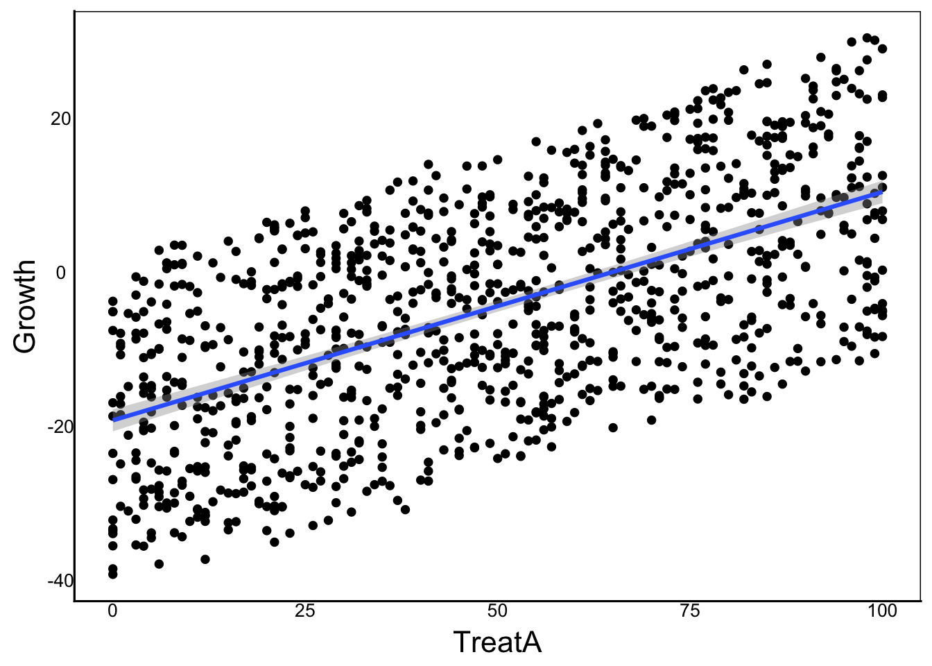
ggplot(aes(x=TreatB, y=Growth),
       data=SimDat) +
  geom_point() +
  geom_smooth(method="lm")
`geom_smooth()` using formula = 'y ~ x'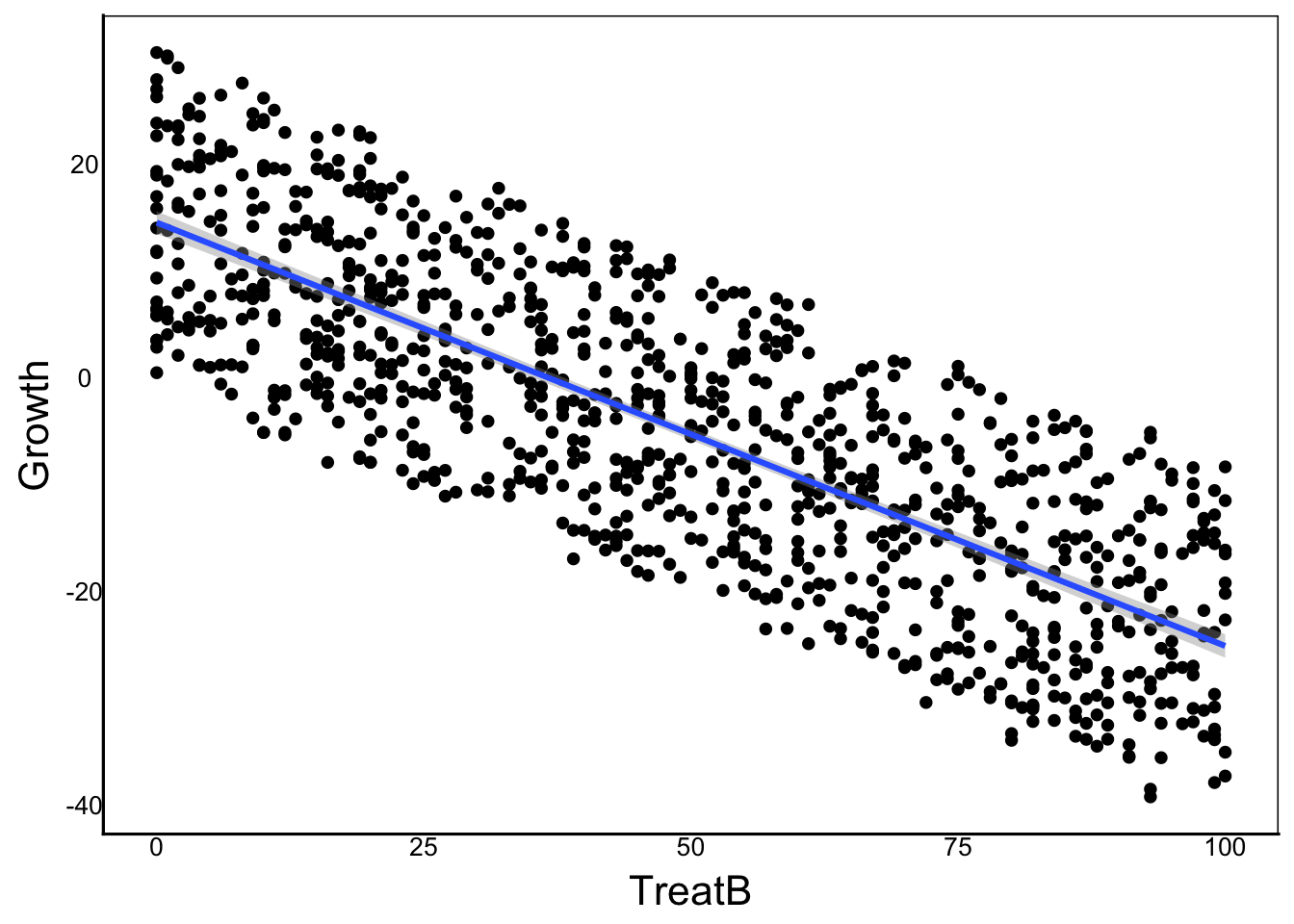
GrowthMod<-lm(Growth ~ TreatA + TreatB, data=SimDat)
summary(GrowthMod)
Call:
lm(formula = Growth ~ TreatA + TreatB, data = SimDat)

Residuals:
    Min      1Q  Median      3Q     Max
-2.7720 -0.7192  0.0347  0.6743  3.2024

Coefficients:
             Estimate Std. Error  t value Pr(>|t|)
(Intercept) -0.114359   0.079801   -1.433    0.152
TreatA       0.299755   0.001073  279.287   <2e-16 ***
TreatB      -0.398664   0.001066 -374.079   <2e-16 ***
---
Signif. codes:  0 '***' 0.001 '**' 0.01 '*' 0.05 '.' 0.1 ' ' 1

Residual standard error: 0.9841 on 997 degrees of freedom
Multiple R-squared:  0.9954,    Adjusted R-squared:  0.9954
F-statistic: 1.082e+05 on 2 and 997 DF, p-value: < 2.2e-16anova(GrowthMod)Analysis of Variance Table
Response: Growth
Df Sum Sq Mean Sq F value Pr(>F)
TreatA 1 74035 74035 76446 < 2.2e-16 ***
TreatB 1 135522 135522 139935 < 2.2e-16 ***
Residuals 997 966 1
---
Signif. codes: 0 '***' 0.001 '**' 0.01 '*' 0.05 '.' 0.1 ' ' 1Polynomial Regression
A polynomial regression is a special type of multiple regression where the different predictors are polynomial functions of the same variable.
\[ Y_i = \beta_0 + \beta_1 X_{1,i} + \beta_2 X^2_{1,i} + \beta_n X^n_{1,i} + ... + \epsilon_i\] This is easier to understand with an example.
Let’s say we want to look at the relationship between plant height and plant biomass, with biomass following a quadratic relationship:
N<-1000 # Sample Size
Beta0<-0 # Overall mean
SlopeA<-0.3 # Slope for 1st continuous predictor
SlopeB<- -0.4 # Slope for 2nd (quadratic) predictor
SimDat<-data.frame(
  Height=sample(c(0:1000)/100,N, replace=T),
  # Individual error with a mean of 0 and sd of 1
  Err=rnorm(N, mean=0, sd=1)
) %>%
  mutate(Biomass = Beta0 + SlopeA*Height + SlopeB*Height^2 + Err)

ggplot(aes(x=Height, y=Biomass),
       data=SimDat) +
  geom_point() +
  geom_smooth(method="lm")
`geom_smooth()` using formula = 'y ~ x'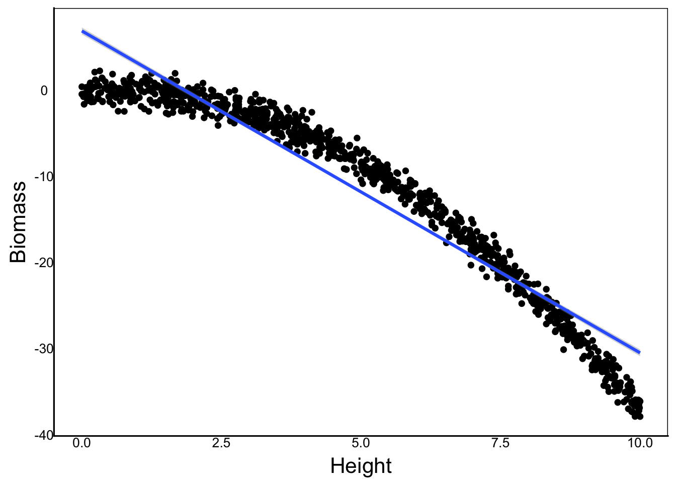
To fit a polynomial, we could use the Identity I function inside lm, but there is a problem:
GrowthMod<-lm(Biomass ~ Height + I(Height^2) , data=SimDat)
summary(GrowthMod)
Call:
lm(formula = Biomass ~ Height + I(Height^2), data = SimDat)

Residuals:
     Min       1Q   Median       3Q      Max
-3.00146 -0.71496 -0.01533  0.68273  2.94893

Coefficients:
             Estimate Std. Error t value Pr(>|t|)
(Intercept) -0.137145   0.098036  -1.399    0.162
Height       0.371397   0.044576   8.332 2.61e-16 ***
I(Height^2) -0.407120   0.004275 -95.225  < 2e-16 ***
---
Signif. codes:  0 '***' 0.001 '**' 0.01 '*' 0.05 '.' 0.1 ' ' 1

Residual standard error: 1.007 on 997 degrees of freedom
Multiple R-squared:  0.992, Adjusted R-squared:  0.9919
F-statistic: 6.146e+04 on 2 and 997 DF, p-value: < 2.2e-16anova(GrowthMod)Analysis of Variance Table
Response: Biomass
Df Sum Sq Mean Sq F value Pr(>F)
Height 1 115483 115483 113850.8 < 2.2e-16 ***
I(Height^2) 1 9198 9198 9067.9 < 2.2e-16 ***
Residuals 997 1011 1
---
Signif. codes: 0 '***' 0.001 '**' 0.01 '*' 0.05 '.' 0.1 ' ' 1Let’s look at a qubic relationship for comparison:
SlopeC<- -2
SimDat<-SimDat %>%
  mutate(Biomass2 = Beta0 + SlopeA*Height +
           SlopeB*Height^2 + SlopeC*Height^3 +
Err)GrowthMod<-lm(Biomass2 ~ Height + I(Height^2) + I(Height^3),
data=SimDat)
anova(GrowthMod)Analysis of Variance Table
Response: Biomass2
Df Sum Sq Mean Sq F value Pr(>F)
Height 1 287699795 287699795 283740631 < 2.2e-16 ***
I(Height^2) 1 51789157 51789157 51076463 < 2.2e-16 ***
I(Height^3) 1 1466001 1466001 1445827 < 2.2e-16 ***
Residuals 996 1010 1
---
Signif. codes: 0 '***' 0.001 '**' 0.01 '*' 0.05 '.' 0.1 ' ' 1summary(GrowthMod)
Call:
lm(formula = Biomass2 ~ Height + I(Height^2) + I(Height^3), data = SimDat)

Residuals:
    Min      1Q  Median      3Q     Max
-2.9589 -0.7127 -0.0211  0.6813  2.9242

Coefficients:
             Estimate Std. Error   t value Pr(>|t|)
(Intercept) -0.237635   0.130236    -1.825   0.0684 .
Height       0.489653   0.110319     4.438 1.01e-05 ***
I(Height^2) -0.436466   0.025405   -17.180  < 2e-16 ***
I(Height^3) -1.998053   0.001662 -1202.425  < 2e-16 ***
---
Signif. codes:  0 '***' 0.001 '**' 0.01 '*' 0.05 '.' 0.1 ' ' 1

Residual standard error: 1.007 on 996 degrees of freedom
Multiple R-squared:      1, Adjusted R-squared:      1
F-statistic: 1.121e+08 on 3 and 996 DF,  p-value: < 2.2e-16
Notice that our third polynomial is not significant, even though it should be because of our linear model. The reason for this is complicated, but it has to do with the fact that the polynomial predictors are not orthoganal (i.e. independent predictors).
We can solve this problem with the poly() function. Note how it changes the estimates:
GrowthMod<-lm(Biomass2 ~ poly(Height,degree=3), data=SimDat)
summary(GrowthMod)
Call:
lm(formula = Biomass2 ~ poly(Height, degree = 3), data = SimDat)

Residuals:
    Min      1Q  Median      3Q     Max
-2.9589 -0.7127 -0.0211  0.6813  2.9242

Coefficients:
                            Estimate Std. Error t value Pr(>|t|)
(Intercept)               -5.241e+02  3.184e-02  -16458   <2e-16 ***
poly(Height, degree = 3)1 -1.696e+04  1.007e+00  -16845   <2e-16 ***
poly(Height, degree = 3)2 -7.196e+03  1.007e+00   -7147   <2e-16 ***
poly(Height, degree = 3)3 -1.211e+03  1.007e+00   -1202   <2e-16 ***
---
Signif. codes:  0 '***' 0.001 '**' 0.01 '*' 0.05 '.' 0.1 ' ' 1

Residual standard error: 1.007 on 996 degrees of freedom
Multiple R-squared:      1, Adjusted R-squared:      1
F-statistic: 1.121e+08 on 3 and 996 DF, p-value: < 2.2e-16anova(GrowthMod)Analysis of Variance Table
Response: Biomass2
Df Sum Sq Mean Sq F value Pr(>F)
poly(Height, degree = 3) 3 340954953 113651651 112087640 < 2.2e-16 ***
Residuals 996 1010 1
---
Signif. codes: 0 '***' 0.001 '**' 0.01 '*' 0.05 '.' 0.1 ' ' 1We can also add the polynomial term to ggplot object if we use the formula parameter in geom_smooth
ggplot(aes(x=Height, y=Biomass),
       data=SimDat) +
  geom_point() +
  geom_smooth(method="lm", formula=y ~ poly(x,3, raw=TRUE))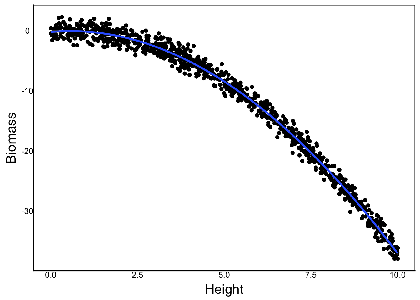
Quality Checks
Two key assumptions of our linear models are:
residual error follows a normal distribution with a mean of zero
AND
error variance is independent of predictors
There are a few convenient ways to check this, but first we’ll set up a toy model.
N<-1000
B0<-0
B1<-0.03
TestDat<-data.frame(
  PredCon=sample(c(1:100)/10,N,replace=T),
  PredNom=sample(c("A","B","C"), N, replace=T),
  Err=rnorm(N, mean=0, sd=1)
) %>%
  mutate(PredNomMean=recode(PredNom,"A"=0,"B"=5,"C"=-5)) %>%
  mutate(Response=B0+B1*PredCon+PredNomMean+Err)

TestMod<-lm(Response ~ PredCon + PredNom, data=TestDat)
anova(TestMod)
Analysis of Variance Table
Response: Response
Df Sum Sq Mean Sq F value Pr(>F)
PredCon 1 0.2 0.2 0.2407 0.6238
PredNom 2 16850.7 8425.3 8839.1708 <2e-16 ***
Residuals 996 949.4 1.0
---
Signif. codes: 0 '***' 0.001 '**' 0.01 '*' 0.05 '.' 0.1 ' ' 1summary(TestMod)
Call:
lm(formula = Response ~ PredCon + PredNom, data = TestDat)

Residuals:
    Min      1Q  Median      3Q     Max
-3.1999 -0.6896 -0.0052  0.6190  2.8556

Coefficients:
            Estimate Std. Error t value Pr(>|t|)
(Intercept) -0.13321    0.07588  -1.756 0.079463 .
PredCon      0.03593    0.01073   3.347 0.000847 ***
PredNomB     5.14029    0.07566  67.936  < 2e-16 ***
PredNomC    -4.91573    0.07563 -65.001  < 2e-16 ***
---
Signif. codes:  0 '***' 0.001 '**' 0.01 '*' 0.05 '.' 0.1 ' ' 1

Residual standard error: 0.9763 on 996 degrees of freedom
Multiple R-squared:  0.9467,    Adjusted R-squared:  0.9465
F-statistic:  5893 on 3 and 996 DF,  p-value: < 2.2e-16
This model should meet our assumptions, but let’s check. There are three main ways to do this, all using the residuals of our model, which we can calculate manually, or use the residuals function on our model object.
Histogram
ggplot()+
  geom_histogram(aes(x=residuals(TestMod)))
`stat_bin()` using `bins = 30`. Pick better value `binwidth`.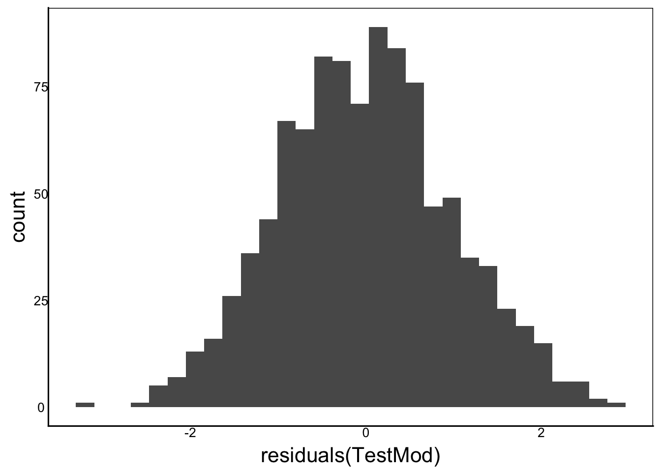
This looks normal, and is centered around zero, but what is a normal distribution supposed to look like? We can use our qnorm function to generate the expected quantile of each observation. We could then plot the observed vs. expected values.
This is called the quantile-quantile or q-q plot
Q-Q Plot
The Quantile-Quantile (Q-Q) Plot bins the residuals the same way we would for a histogram, but then calculates the number of observations we expect in each bin for a normal distribution. If the data are perfectly normal, then all the points will fall along the 1:1 line
ggplot() +
  stat_qq(aes(sample=residuals(TestMod))) +
  stat_qq_line(aes(sample=residuals(TestMod)))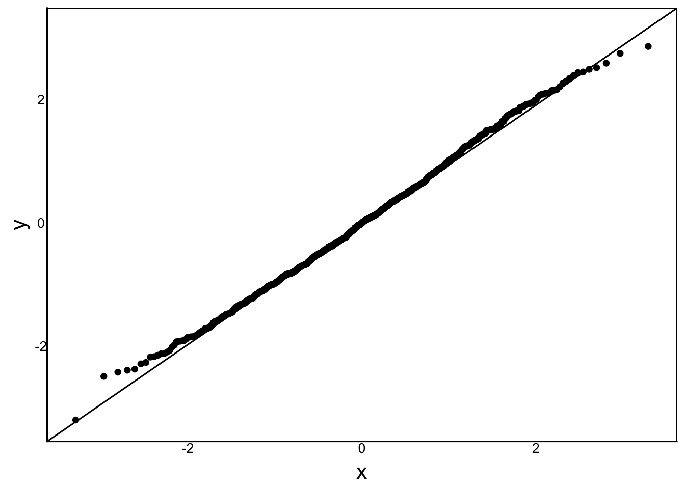
We can see some very slight deviation from the line at the extreme values, where we have a small sample size
Homoskedasticity
The last test is to make sure that variance is constant across our predictors. We can do this for each predictor variable alone, as well as the overall prediction from the model. To do this, let’s add residuals to the dataset:
TestDat$Residuals<-residuals(TestMod)
ggplot(aes(x=PredCon, y=Residuals),
       data=TestDat) +
  geom_point()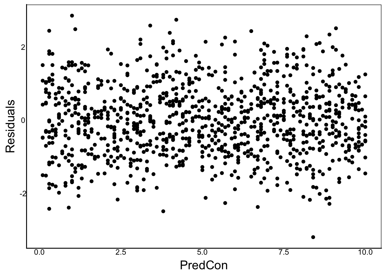
ggplot(aes(x=PredNom, y=Residuals),
       data=TestDat) +
  geom_boxplot()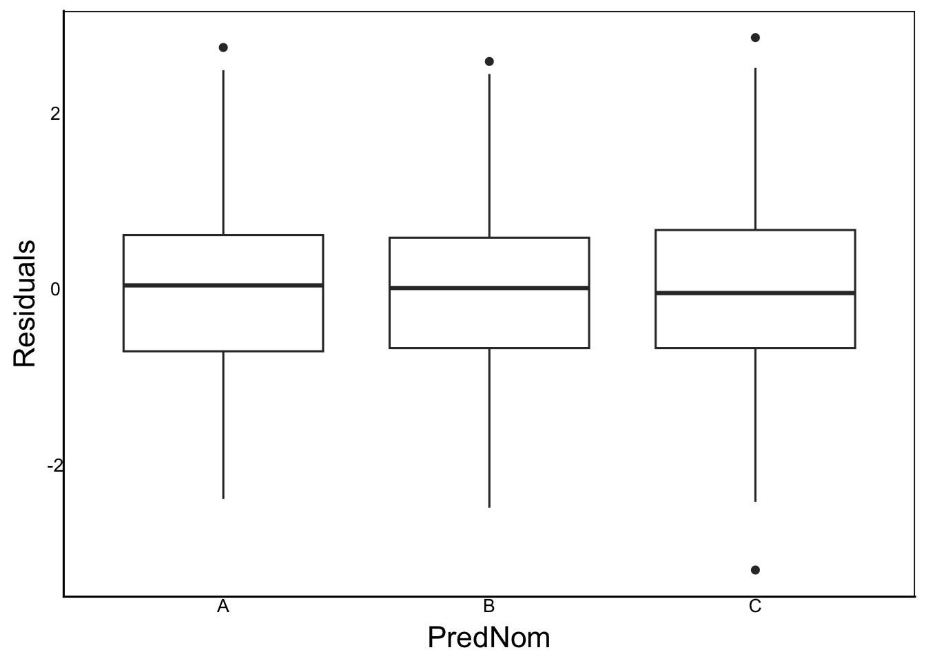
Note how the variance is similar range, centred at zero across all values of x in both graphs. We should not see any correlation between the x- and y- axes, or any large change in variance.
In addition to the predictor variables, we should look at the overall predicted values from our full statistical model.
We can generate the predicted values using the estimates from the linear model output. But an easier way is the predict() function.
TestDat$Predicted<-predict(TestMod)
ggplot(aes(x=Predicted, y=Residuals),
       data=TestDat) +
  geom_point()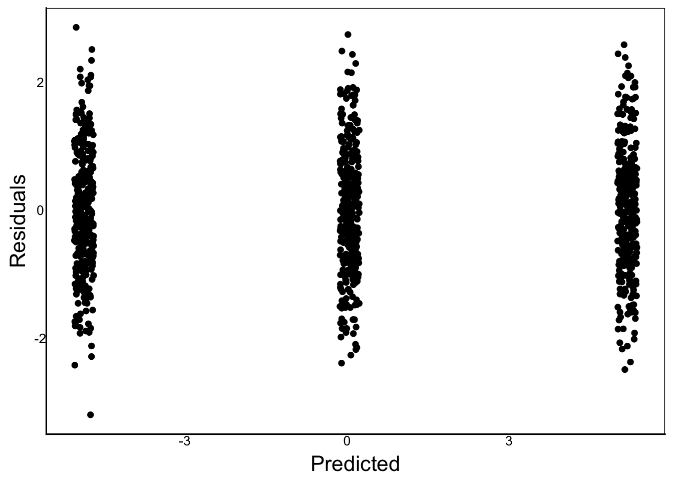
Since we have continuous + nominal predictors we want to make sure that each group is centered at zero with similar variance with no correlations between the x- and y-axis.
Violations
Let’s make a couple of models that violate the assumptions for comparison.
Nonlinear Relationship
The first example is the quadratic relationship, but fit with a linear predictor without the poly() function.
# Make a new response variable
TestDat<-TestDat %>%
  mutate(Response2=B0+B1*PredCon+0.2*PredCon^2+PredNomMean+Err)

# Run the linear model
TestMod2<-lm(Response2 ~ PredCon + PredNom, data=TestDat)

# Calculate predictions and residuals of the linear model
TestDat$Predicted2<-predict(TestMod2)
TestDat$Residuals2<-residuals(TestMod2)

# Plot to look for problems
ggplot(aes(x=Residuals2), data=TestDat)+
  geom_histogram()
`stat_bin()` using `bins = 30`. Pick better value `binwidth`.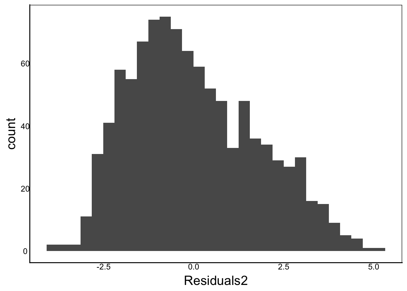
Histogram Observation: In the graph above, we can see a slight positive skew
QQplot:
ggplot(aes(sample=Residuals2), data=TestDat) +
  stat_qq() + stat_qq_line()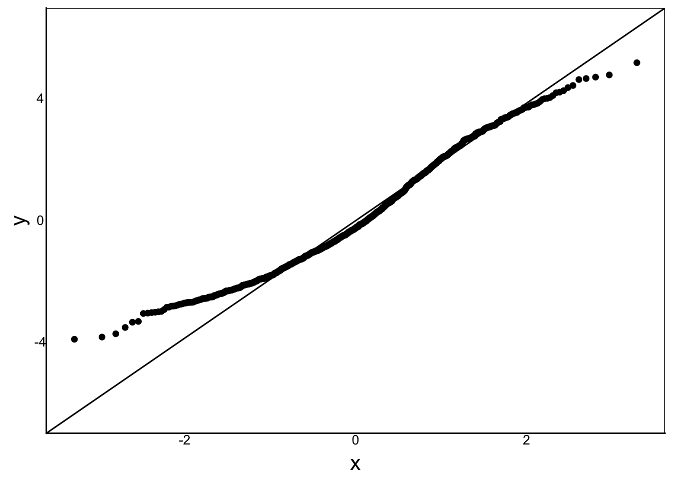
Q-Q Plot Observation: Some over-dispersion relative to the normal distribution.
ggplot(aes(x=PredCon, y=Residuals2),
       data=TestDat) +
  geom_point()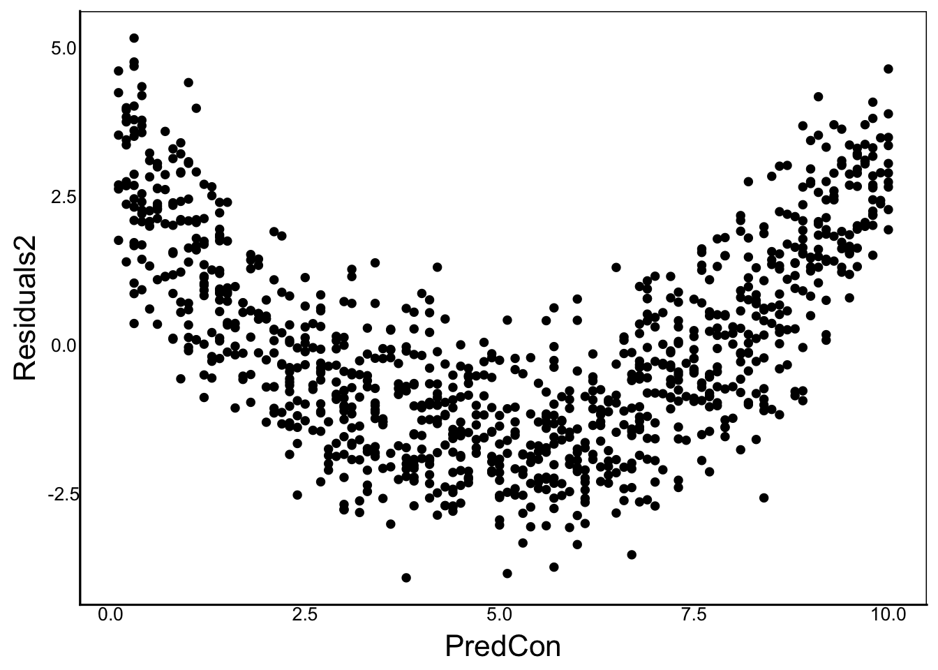
Residuals x Continuous Predictor Observation: We can see a very clear pattern in the residuals, which is a violation of our model assumption that the residuals are indepdent of the predictors.
ggplot(aes(x=PredNom, y=Residuals2),
       data=TestDat) +
  geom_boxplot()
Residuals x Categorical Predictor Observation: These residuals look good – similar means and variances across prediction categories.
ggplot(aes(x=Predicted2, y=Residuals2),
       data=TestDat) +
  geom_point()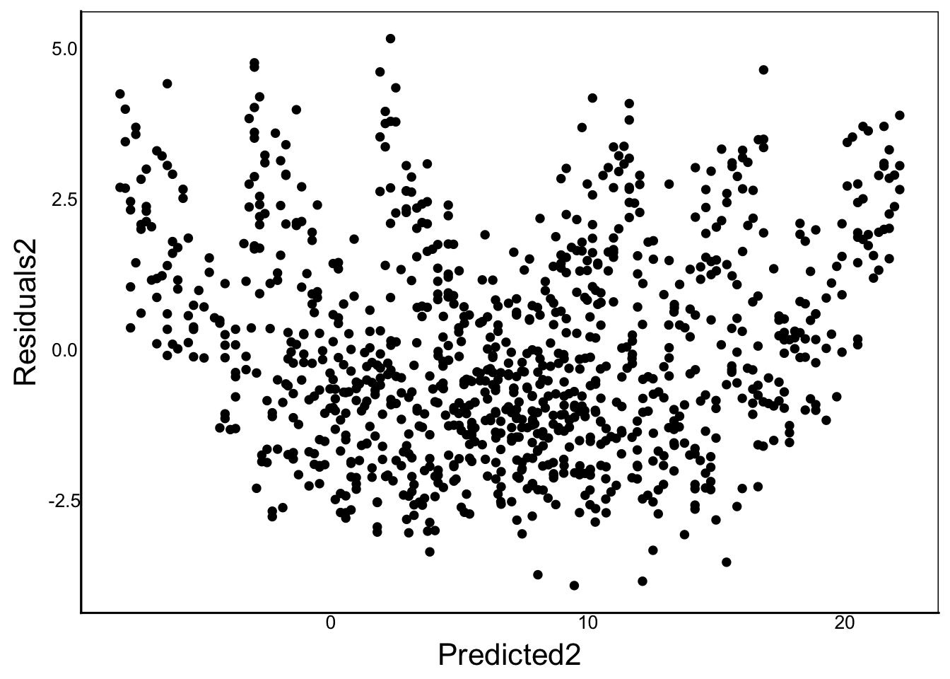
Residuals x Model Prediction Observation: Some clear non-random patterns in the residuals. The x-axis is the predicted value of the model (i.e. the equation excluding the error term).
Log-Normal Response
Next, let’s fit a regular linear model to data with log-normal residuals
# Make a new response variable
TestDat<-TestDat %>%
  mutate(Response3=exp(B0+B1*PredCon+PredNomMean+Err))

# Run the linear model
TestMod3<-lm(Response3 ~ PredCon + PredNom, data=TestDat)

# Calculate predictions and residuals of the linear model
TestDat$Predicted3<-predict(TestMod3)
TestDat$Residuals3<-residuals(TestMod3)

# Plot to look for problems
ggplot(aes(x=Residuals3), data=TestDat) +
  geom_histogram()
`stat_bin()` using `bins = 30`. Pick better value `binwidth`.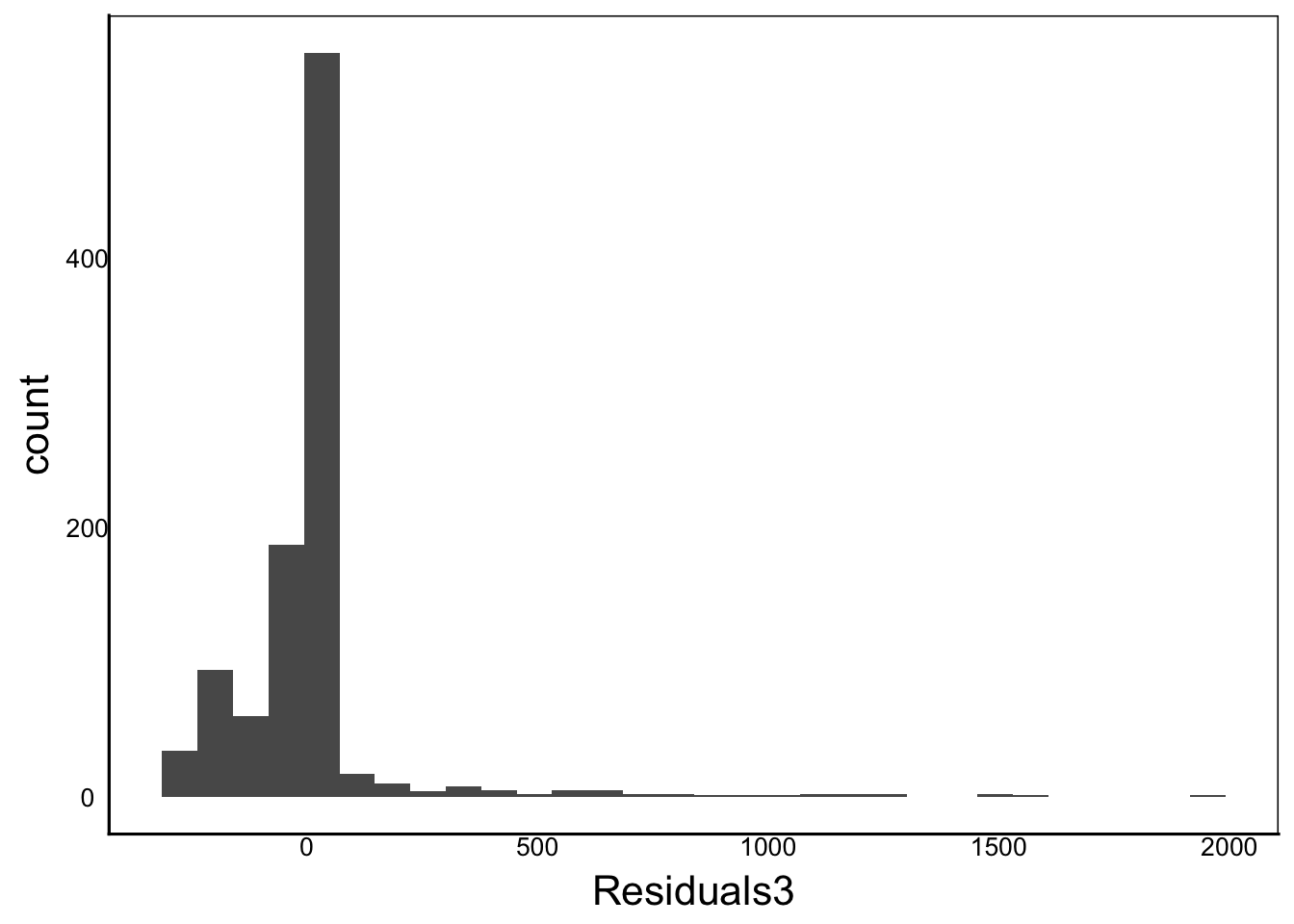
Observation: Very clear skew and kurtosis
ggplot(aes(sample=Residuals3), data=TestDat) +
  stat_qq() + stat_qq_line()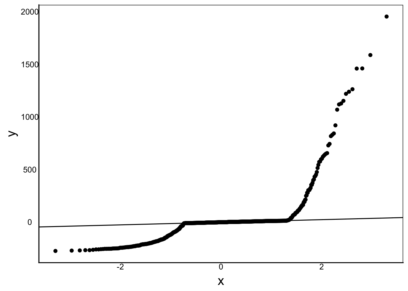
Observation: The data are so bad that the 1:1 line in the q-plot looks like a line with zero slope!
ggplot(aes(x=PredCon, y=Residuals3), data=TestDat) +
  geom_point()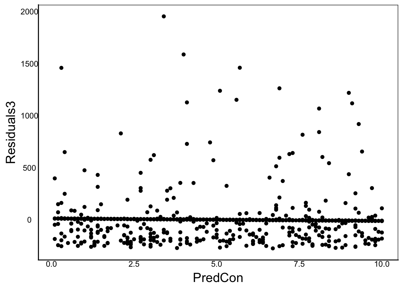
Observation: No clear bias, but note the clustering of points near the bottom
ggplot(aes(x=PredNom, y=Residuals3), data=TestDat) +
  geom_boxplot()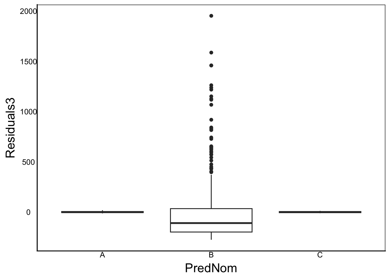
Observation: Clearly heteroskedasticity with different means and much higher variance in group B
ggplot(aes(x=Predicted, y=Residuals3), data=TestDat) +
  geom_point()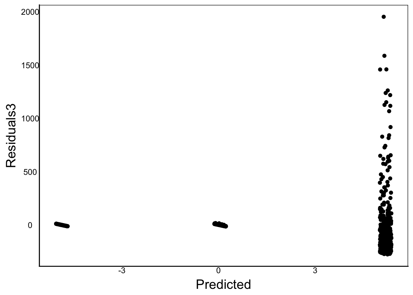
Observation: Again, clear heterskedasticity
Try re-running a similar analysis but log-transform the response variable before running the linear model. You can either create a new column of log-transformed data, or just use the
log()function inside the linear model.
Heteroskedasticity
Now let’s try to make a dataset where the error scales with each predictor.
# Make a new response variable
TestDat<-TestDat %>%
  mutate(Response4=B0+B1*PredCon*Err+
           PredCon*Err+PredNomMean*Err)
Note how the error term is now a function of each predictor, rather than a simple \(\epsilon_i\)
# Run the linear model
TestMod4<-lm(Response4 ~ PredCon + PredNom, data=TestDat)

# Calculate predictions and residuals of the linear model
TestDat$Predicted4<-predict(TestMod4)
TestDat$Residuals4<-residuals(TestMod4)

# Plot to look for problems
ggplot(aes(x=Residuals4), data=TestDat) +
  geom_histogram()
`stat_bin()` using `bins = 30`. Pick better value `binwidth`.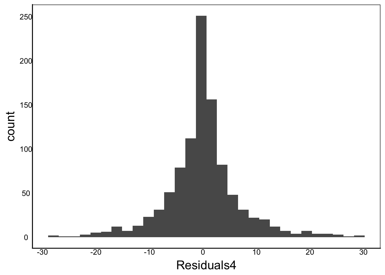
ggplot(aes(sample=Residuals4), data=TestDat) +
  stat_qq() + stat_qq_line()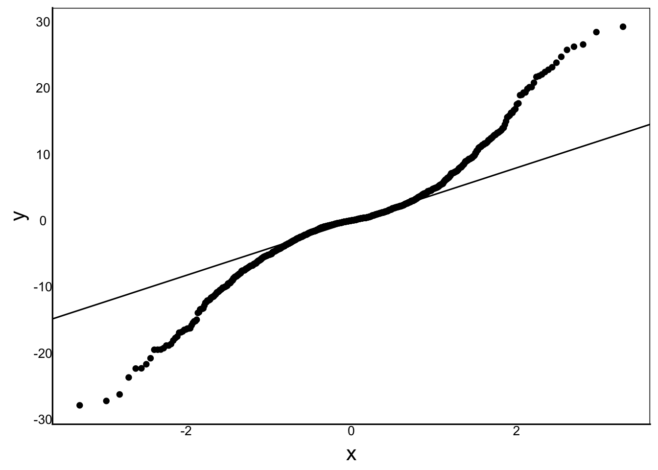
ggplot(aes(x=PredCon, y=Residuals4), data=TestDat) +
  geom_point()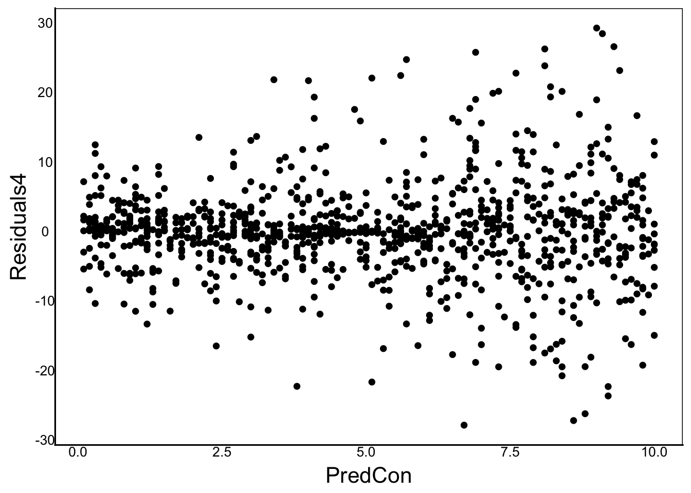
ggplot(aes(x=PredNom, y=Residuals4), data=TestDat) +
  geom_boxplot()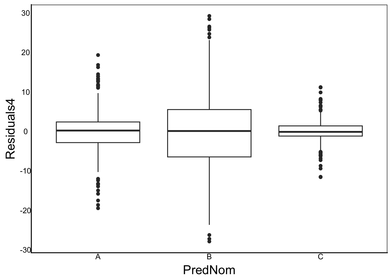
ggplot(aes(x=Predicted, y=Residuals4), data=TestDat) +
  geom_point()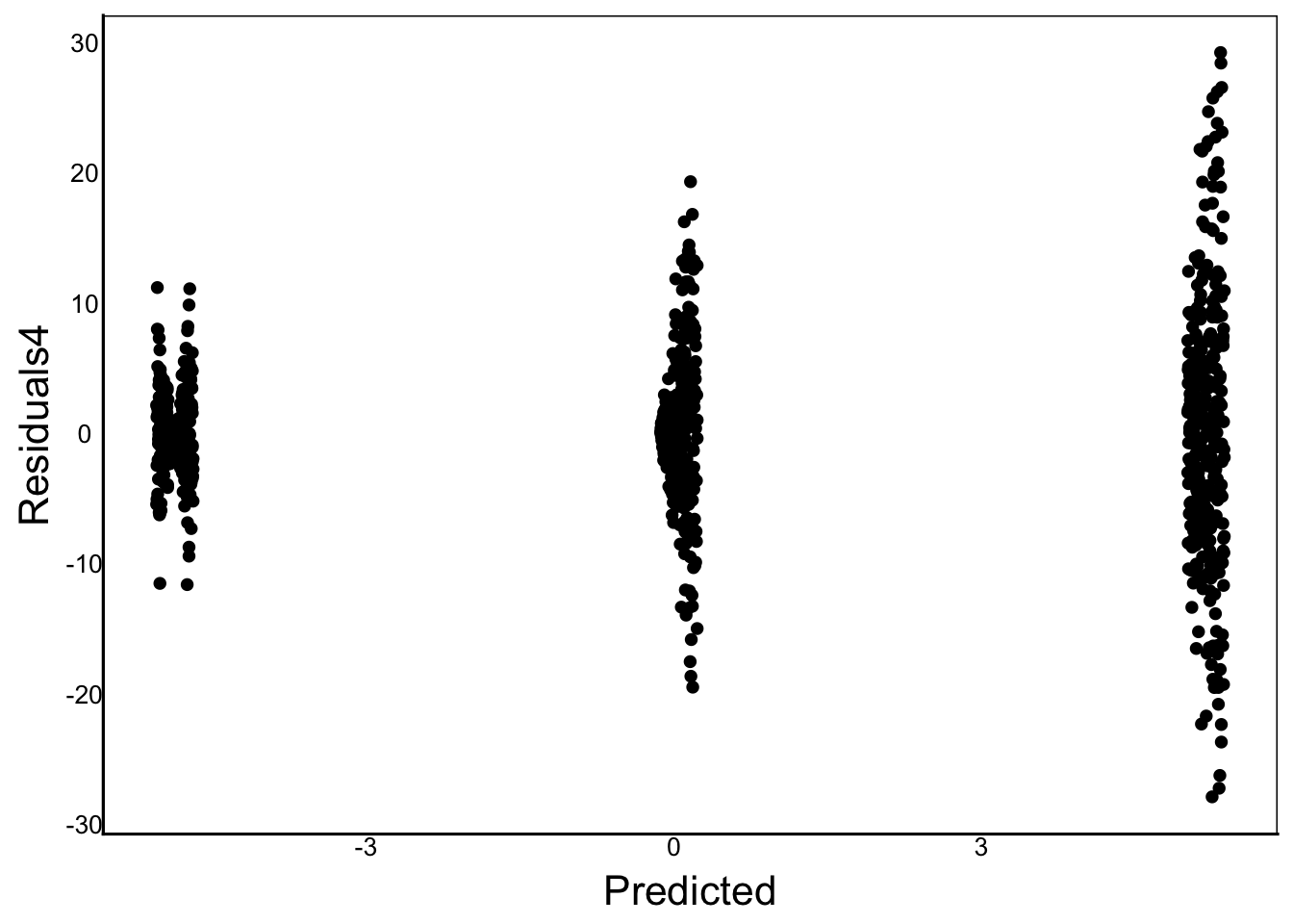
Notice in the above graphs that there is no bias in the mean, but a clear violation in the Q-Q plot and heteroskedasticity across the prediction.
Residuals Matter
Note that in our analysis above, we are analyzing the RESIDUALS. Our assumptions with linear models are about the residuals NOT the predictor or response variables.
Let’s look back at our original, well-behaved model as an example. Compare the histograms of the response and predictors:
ggplot() +
  geom_histogram(aes(TestDat$Response))
`stat_bin()` using `bins = 30`. Pick better value `binwidth`.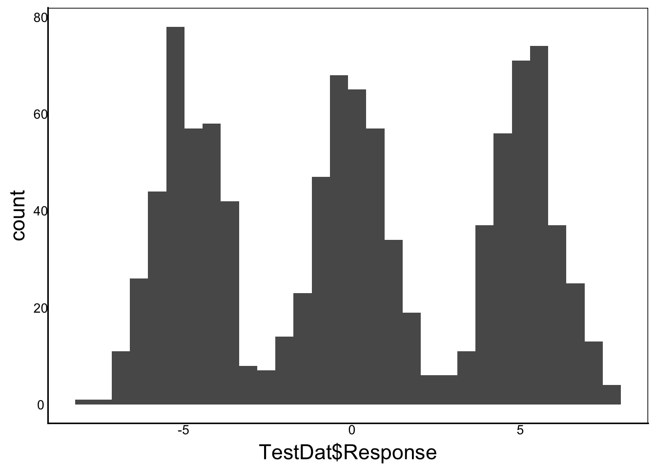
Our response variable is clearly not normal, it is tri-modal! But this is NOT a violation because it turns out these peaks correspond to the different means of the three categorical predictors. Note that neither of our predictors are normal either:
ggplot() +
  geom_histogram(aes(TestDat$PredCon))
`stat_bin()` using `bins = 30`. Pick better value `binwidth`.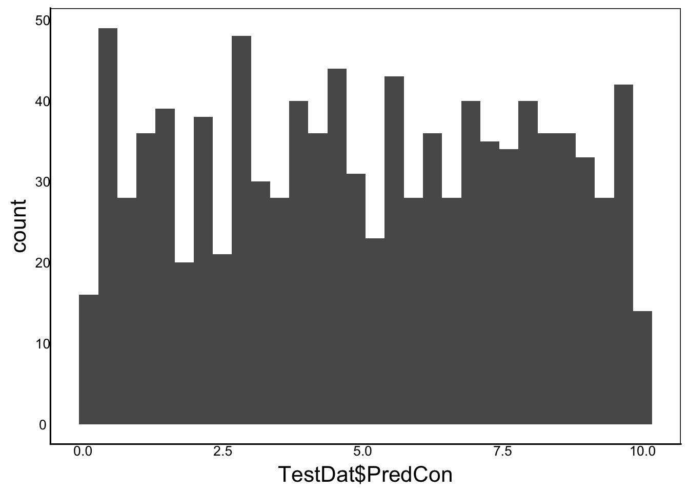
ggplot() +
  geom_bar(aes(TestDat$PredNom))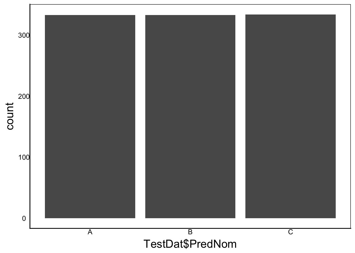
However, when we look at the residuals, they perform very well
ggplot() +
  geom_histogram(aes(x=residuals(TestMod)))
`stat_bin()` using `bins = 30`. Pick better value `binwidth`.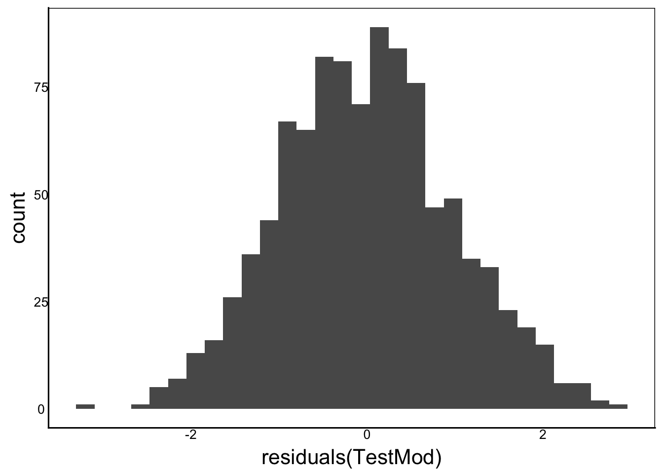
ggplot() +
  stat_qq(aes(sample=residuals(TestMod))) +
  stat_qq_line(aes(sample=residuals(TestMod)))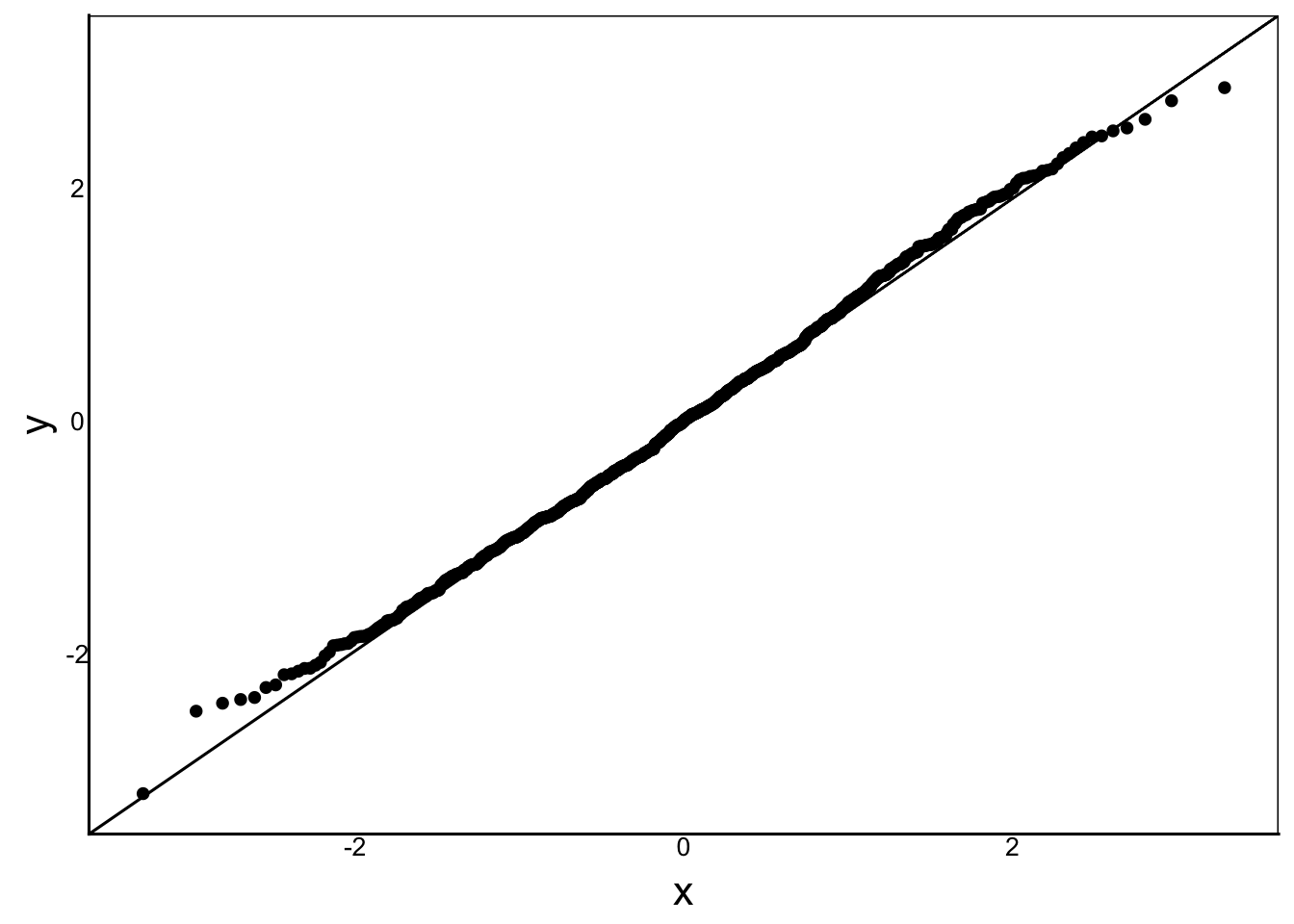
There is nothing wrong with the sample or the model! It doesn’t matter that the predictors and response are not normally distributed, as long as the residuals are.
Question: Why is there a trimodal distribution in the response variable but not the residuals?
Answer: We have three groups with different means, showing up in the response as three peaks. When we take out the means by including the predictor in our linear model, then the residuals are the deviation from the group means, resulting in a single peak.
QC Tools
Once you understand how these quality checks work, there are some tools you can use to quickly plot and view the diagnostic graphs.
The autoplot() function in theggfortify package is a nice complement to ggplot for generating diagnostic graphs. You can even colour code your predictors:
library(ggfortify)
autoplot(TestMod, which=1:4, data=TestDat, colour = 'PredNom')
Warning: `fortify(<lm>)` was deprecated in ggplot2 4.0.0.
ℹ Please use `broom::augment(<lm>)` instead.
ℹ The deprecated feature was likely used in the ggfortify package.
Please report the issue at <https://github.com/sinhrks/ggfortify/issues>.Warning: `aes_string()` was deprecated in ggplot2 3.0.0.
ℹ Please use tidy evaluation idioms with `aes()`.
ℹ See also `vignette("ggplot2-in-packages")` for more information.
ℹ The deprecated feature was likely used in the ggfortify package.
Please report the issue at <https://github.com/sinhrks/ggfortify/issues>.Warning: Using `size` aesthetic for lines was deprecated in ggplot2 3.4.0.
ℹ Please use `linewidth` instead.
ℹ The deprecated feature was likely used in the ggfortify package.
Please report the issue at <https://github.com/sinhrks/ggfortify/issues>.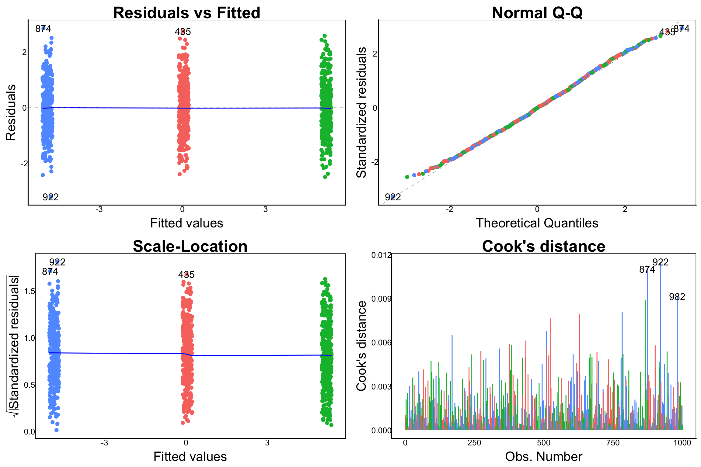
Note the Cook’s distance plot, which we haven’t seen yet. This checks whether you have a few outlier data points that contribute disproportionately to the fit of the model. The row numbers are shown for potential outliers, but looking at the figure we can see that the Cook’s distance measure is not much higher for these than for several other points.
Try adding an outlier to the
TestDatdataset to see what this would look like in the Cook’s distance plot.
You can generate other analytical plots with the which function. See ?autoplot for more examples.